Into Production! David King and the “House-Style of the Loony Left” (2017)
Essay by Theo Inglis
You must go into real work, carry your own organisational talent where it is needed – into production. – Osip Brik, LEF, 1923
For a few weeks during the early months of 2016, while in the throes of research, I found that my life unexpectedly revolved around three men, all of whom were in their 80s. All three live in North London, were once graphic designers, and at some point during their long and distinguished careers were engaged in design work for broadly left-wing political purposes. When visiting the home offices of these designers, I sat surrounded by the output of their careers as well as pieces of design and ephemeral items saved for their personal resonance. These printed objects all helped to direct and define these designers’ own aesthetics. Reports of the “death of print” have surely been premature, but being in the studios of these post-war designers I felt conscious of how much had changed, how physical and tactile every aspect of design had once been. The means of production have been seized, simplified and digitised, and yet I couldn’t help feeling that something has been lost along the way.
Graphic designers who have achieved a certain level of success or fame, can, upon retiring, have their portfolios and collections instantly become archives. These archives are ready-made (though often chaotic) bodies of knowledge, available for donation if there is a willing university or museum. Here, they will be accessible for the reference of future generations, their place in design history hopefully solidified. Yet there is now also an arduous task beyond collection: the physical objects, if not available as digital images, risk fading into obscurity if inaccessible and unknown to the majority who will never be able to visit in person. The American graphic designer Paul Rand once said that “the artist is by necessity a collector; he accumulates things with the same ardour and curiosity with which a boy stuffs his pockets”.[1] Although this idea still holds true for designers, it is often no longer physical objects that are collected today. Rather it is photographs or scans of once printed material that populate the “curated” Tumblr, Pinterest, Twitter and Instagram feeds of contemporary graphic designers.
The digital collections that these websites foster generally have little purpose beyond the vague notion of “design inspiration” or a diaristic function. Mostly they just fulfil the common impulse to share. We now have access to a far wider pool of reference than ever before, both historical and contemporary. Yet, along the way, political meaning or context can be lost; an endless stream of images can make aesthetics dominant over meaning. But what makes a design collection (digital or otherwise) useful in the first place? Focus and context definitely, and the idea that through collection these things are saved from obscurity. The collection of material means a judgement has been made on what is worth saving from, to borrow a phrase from Leon Trotsky, the “trash heap of history”.[2]
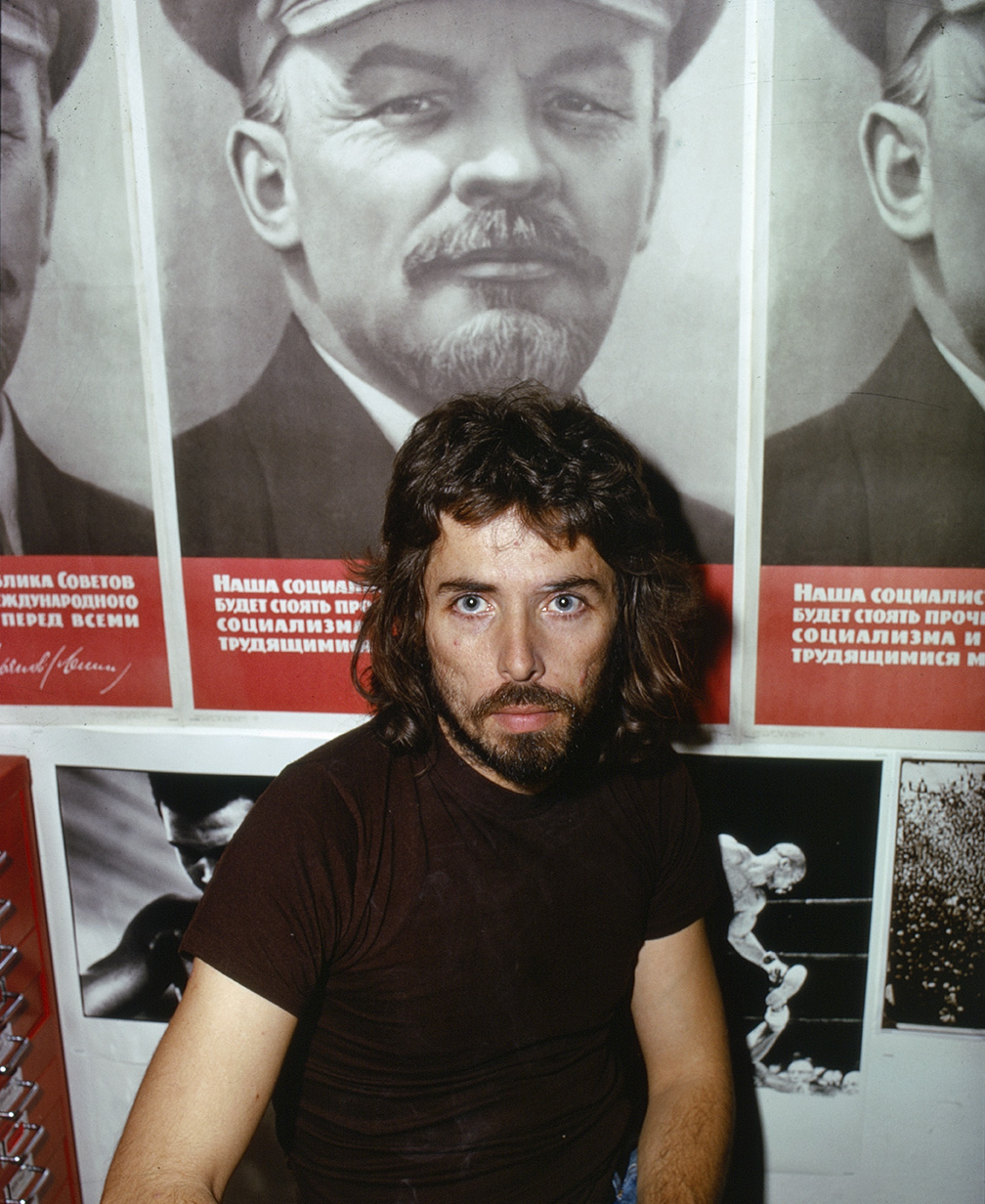
It seems appropriate, considering the three designers I visited and their collections and political projects, to extend these thoughts to David King. When it comes to post-war designers with an interest in left-wing politics, no one did more to break down the barriers between politics, life and work than King, who sadly died in May 2016 at the age of 73. King’s collection was far more than just the accumulated detritus of a long career. His Islington home, once nicknamed “Trot-ski-lodge”, featured an enormous bust of Karl Marx in its garden and held a vast collection that far surpassed that of any other designer past or present both in its scale and purposeful curation.[3] King first rose to prominence as an editorial designer working for Queen, The Observer, and then, most notably, The Sunday Times Magazine in the 1960s and early 1970s. It was here that he became an art editor, soon proposing and generating his own feature articles, taking the photographs and designing the final layouts himself in a rare case of total design autonomy.
It was through this role that King first travelled to communist Russia in 1970 while researching an article on the October Revolution. In the USSR, King discovered that Leon Trotsky, who he had hoped to research there, had been meticulously scoured from history; Josef Stalin had “totally wiped Trotsky out”.[4] Recognising that people and their work can be purposefully erased from the historical record was no doubt a huge impetus for King as a collector. After his visit, his interest and beliefs in communism, Marxism and especially Trotskyism became a greater influence on his design work. In Red Star Over Russia, his 2010 visual history of the Soviet Union, King explains “even as a child I despised capitalism”.[5] His socialist uncle and Stalinist geography teacher set King on an alternative political path from an early age. While at the London College of Printing, tutor Robin Fior showed King how politics and design could be intrinsically linked. It was with Fior in 1962 that he first used the “paste-up” method (cutting and sticking by hand) on layouts for the pacifist newspaper Peace News, King’s first political client.
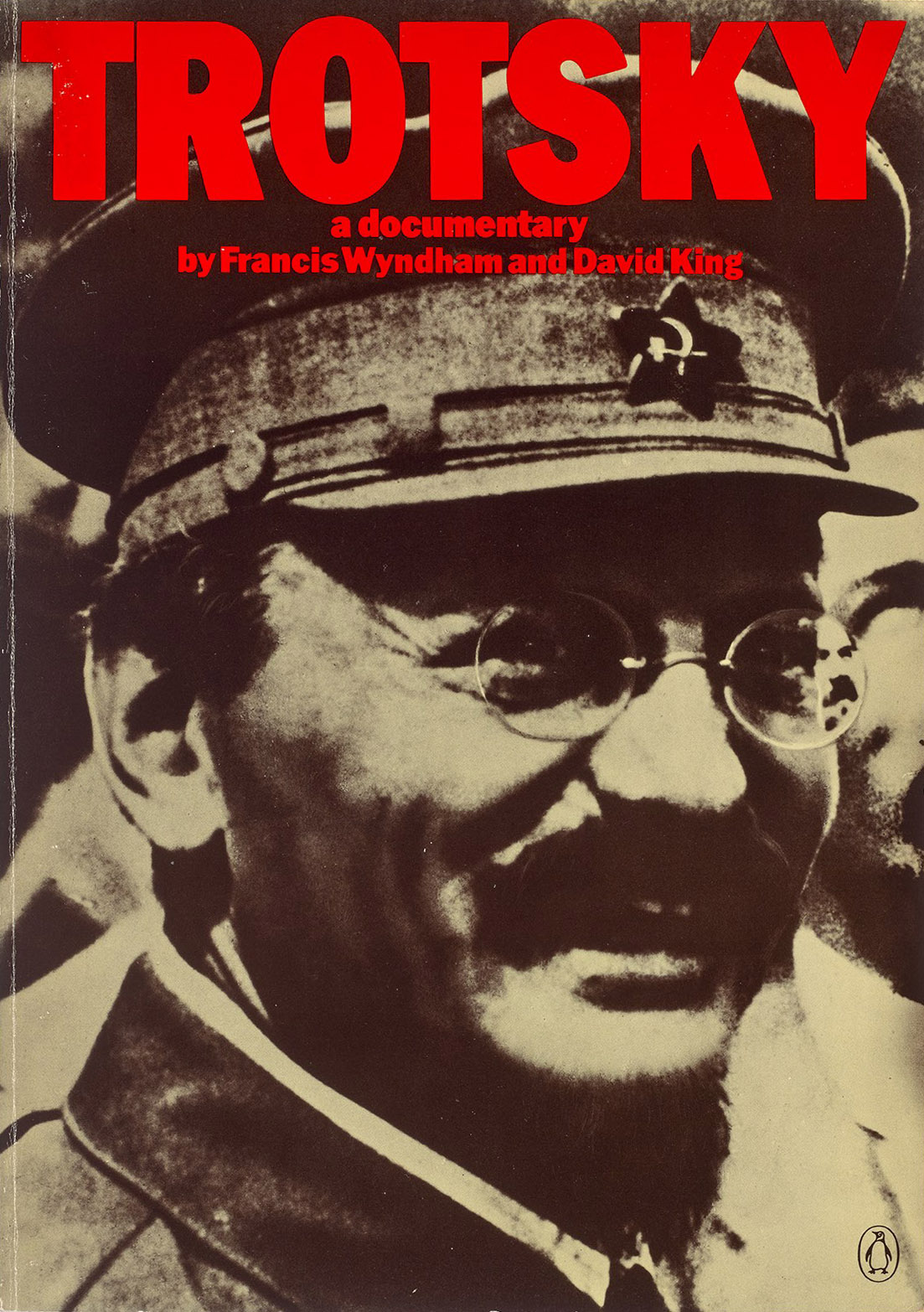
Over the next four decades, in parallel with his work as a designer, King’s Soviet collection became a gargantuan archive of approximately 250,000 artefacts (King’s best guess). The David King Collection came to be recognised as an “unrivalled” resource with “immense potential for opening up as yet untold histories”.[6] How a practising designer managed to find the time, money and connections to build up such a vast and contentious collection remains a mystery. But King’s intent becomes clear through the books he co-authored and designed, all of which are centred on pieces and themes from his collection. Visual histories such as The Commissar Vanishes, Ordinary Citizens and Trotsky: A Photographic Biography weave narratives and shed light on stories that have been suppressed or obscured, and that would have remained unknown without such rich visual material from King’s collection to bring them back to life. These books convey the potential power of visual communication and the image, put to both positive and more malign ends – anything with the power to inform can also deceive. The Commissar Vanishes (1997), subtitled The Falsification of Photographs and Art in Stalin’s Russia, is one of the clearest examples of this malignancy, exposing how under Stalin’s rule photographs were routinely and repeatedly doctored to remove those that Stalin had secretly condemned to death as “traitors”. Often this was done because they were deemed to “know too much”, which usually meant they knew the actual truth, rather than Stalin’s corrupted version.
King made the decision to donate his entire collection of historical material to the Tate while he was still alive. From May 2002, Tate Modern dedicated a room to showing an ever-changing display of Soviet posters on loan from the collection. In December 2016, the Tate Britain Archive and Reading Rooms held a “show and tell” of pieces they had acquired from King. The chance to see a large range of items with a like-minded yet age-diverse audience was an appropriate alternative to the solitude and bureaucracy of usual archive visits. For King, holding and examining these rare and significant objects had been an everyday pleasure for decades; here, Tate had provided a rare opportunity for the public to do the same. The collection, according to Dor Duncan, one of its many cataloguers at Tate, had been arriving in “dribs and drabs” for years, such was King’s deep personal attachment.[7] Since his death, the last remaining items have finally arrived at the Tate archives and the mammoth task of cataloguing it in its entirety can continue.
Our guides, Duncan and fellow cataloguer Andrey Lazarev, explained the significance and origins of selected objects from King’s collection, recounting stories of the gruesome murders, show-trials and purges that took place as Stalin ruthlessly strengthened his grip on power. People have died for the views expressed in the books which the collection preserves, and King too took a risk in visiting Russia to hunt for these items. Although many of the pieces are primarily interesting for their revolutionary design, the importance of the collection goes much deeper than just the visual. Yet graphic design was King’s original discipline – collector and historian came later – which helps to explains his primarily visual approach to the past, and what made his historical books so captivating.
Constructivist graphic design, key examples of which form part of King’s collection, demonstrate the combination of images, large text and geometric shapes; economical in means but powerful in impact. The paper is cheap and is now yellowing, with minimal use of colour throughout. These designs use the available space to the maximum; often individual elements couldn’t be any larger. The effect is more visually impactful than most of the “less is more” modernism of the International Style that evolved from the various international modern art movements. King’s beloved constructivism has much more inspiration to offer us today than the socialist realist design that replaced it in Russia under Stalin. Although King’s collection includes Russian material from after 1928 (when avant-garde art was condemned as decadent), it was the aesthetic of the post-revolution innovators which had the biggest influence on his own work. This collection was a practical one, providing King with inspiration, historical knowledge and the material for his many books. It will no doubt provide the same intellectual services to many visitors in the future now that it is preserved by Tate.
Such a collection would be a major achievement for any historian or archivist, but for King as a designer, writer, and photographer, the collection was only one aspect of his multifaceted career. The question of usefulness is key. The impetus to collect could so easily be bourgeois, totally self-serving and fuelled by a desire to own objects that are kept out of the hands of other collectors and hidden away from the public. Clearly, this was not the case with King, who regularly welcomed visitors when the collection was held at his home. He frequently included the material in his own published visual histories as well as using it to inform his design work for political causes, such as the British Anti-Apartheid Movement and anti-fascist groups in the late 1970s and early 1980s. The Dutch graphic designer and theorist Jan van Toorn has described the contemporary designer’s role as being a “practical intellectual”.[8] I would posit that David King long embodied the same ideal.
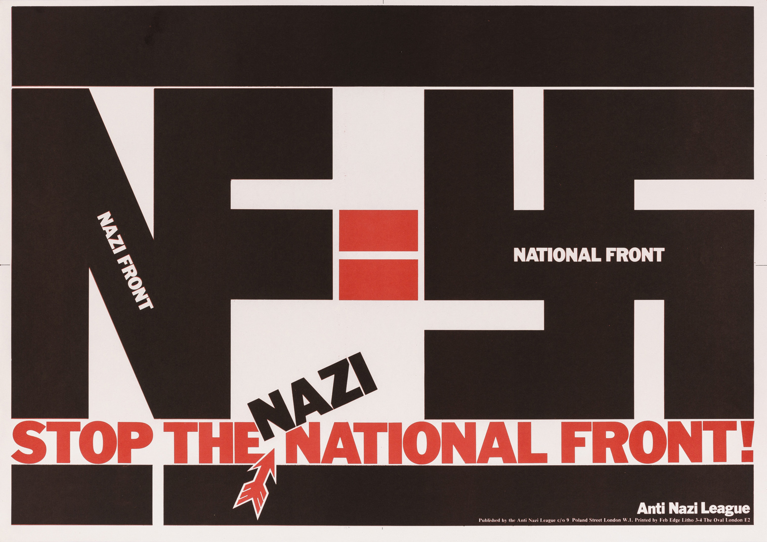
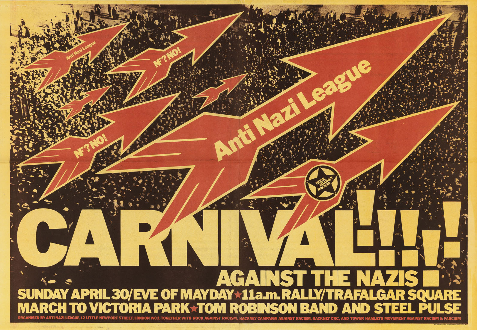
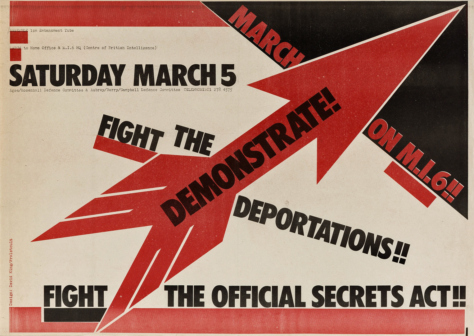
For King, collecting never became a full-time pursuit; it was always accompanied by other work. In 1975, after leaving The Sunday Times Magazine, he worked as an independent designer from his home studio surrounded by his growing collection. King’s major clients over the years included the Crafts Council, the Museum of Modern Art, Oxford (now Modern Art Oxford) and City Limits, a magazine launched in 1981 as a weekly rival to Time Out. King also designed many covers for Penguin Books, working under then art director David Pelham. Pelham told me that he “was the man to go to for punchy political cover art”, and a perfect choice due to both his personal image collection and historical and political interests, which made him “impressively familiar with the titles that needed designing”.[9] After his break with the Sunday Times King committed to becoming a fully-fledged political designer, working for free on posters and placards for political organisations that he believed in, most notably, in the late 1970s, for Rock Against Racism and the Anti-Nazi League. Much of his political graphic design output in poster form is now held in the permanent collection at the Victoria and Albert Museum and in a collection at the University of Reading – the arch-collector himself now collected, his work preserved for its cultural and visual significance.
The best way to appreciate what King achieved is to see these preserved copies of his original printed work, some of which were done with his occasional collaborator Judy Groves, or co-credited to the mysterious moniker of “Proletcult”. King worked for grassroots political organisations on a shoestring budget, and it often shows, but not in a way that diminishes visual impact. In fact, it helped King develop and define his style. The materiality of his printing technique is evident, like the recurrent use of overprinting to create warmer colours. Red and black are used frequently, but he also regularly prints the two on top of each other (black on a base of red) to create a rich and heavy sepia. You can see this used in the crowd photograph in the background of his poster for the London “Carnival Against the Nazis” [above]: a black ink is utilised but no single element is in pure black. This recalls the work of Dutch designer (and fellow anti-fascist) Willem Sandberg and his belief in “warm printing” and rejection of luxury material in favour of a utilitarian roughness.[10] However, if you see King’s posters and expect only drab colours, the still vivid yellows, green, reds, and electric blues that he often used together may come as a surprise. Look closely and often the overprinted layers aren’t perfectly aligned, creating an optical effect that he embraced. For King, the impression of his work seen from a distance by the public was far more important than the kind of close-up scrutiny that designers often subject each other’s work to. The purpose of posters, as King well knew, was, more than anything else, to have a strong visual impact.
Looking through King’s design work there is a consistent aesthetic and frequently recurring motifs; bold capitalised sans-serifs, tight kerning, arrow symbols, inky typewriter fonts, dotty half-tone images, direct messages, exclamation marks, stars, overprinting, dynamic angles, heavy rules, squares and hardly any empty space. All designers will have had the aphorism “less is more” drummed into them at some point during their education. But David King’s work shows that sometimes “more is more” and that some messages are too important to be small or subtle. As the Russian constructivist El Lissitzky wrote in Kurt Schwitters’ periodical Merz in 1923, “In communicating, the printed word is seen, not heard.”[11] Why reject visual power when the content deserves it? Urgent messages demand an urgent visual language! King’s collection and historical interests undoubtedly helped him to glean exactly what this visual language for the left could be in his contemporary context.
Yet his aesthetic was never a pastiche of constructivism or Russian design, and though at times it certainly erred towards homage, his work always retained a fierce originality, one built upon his graphic design forebears. For instance, the origins of how King symbolically used a piercing arrow icon can be seen in El Lissitzky’s famous lithograph Beat the Whites with the Red Wedge (1919). King also used this arrow as the logo of the Anti-Nazi League and it became a powerful emblem that he could use repeatedly in their material, just as stars and the hammer and sickle had been used as symbols under communism. Undoubtedly he also came to a heightened understanding of the power of symbols from the fascism he hated but studied. As John Heartfield’s work had shown King, the weapons of the enemy could be turned against them.
If David King’s work seems stereotypical to us today it is because he was so influential and his style’s powerful simplicity is easily imitated. Some designers, who perhaps didn’t share the same views or level of political commitment as King, supposedly referred to it as the “house-style of the loony left”.[12] In an interview for Eye magazine in 2003, King explained that he felt a focus was still needed among the left, both politically and visually.[13] Yet he also expressed surprise that nobody had yet replaced the aesthetic style he had developed 25 years earlier. The uncompromising boldness of King’s aesthetic did start to look dated by the 1990s and beyond, not to mention overly harsh. But in the current political climate, King’s work deserves to be looked at anew for its raw brute honesty and directness. David King shows us that our lives, politics and work don’t have to be, and in fact shouldn’t be, separate, and that what we believe in should be as visually impactful as possible.
This is an edited version of an essay first published in Gez Barton et al. (eds.), Meet Me in the Present: Documents and Their Afterlives, Royal College of Art, 2017, pp. 60–73. The examples of King’s work above were among those shown. The article is republished here with the permission of Theo Inglis
Notes
1. Steven Heller, Georgette Ballance and Nathan Garland, Paul Rand, a Designer’s Words, New York: School of Visual Arts, 1998, p. 16.
2. William Safire, “On Language; Dust Heaps of History”, New York Times, 16 October 1983.
3. Richard Hollis, “David King Obituary”, Guardian (online), 25 May 2016.
4. David King, Red Star Over Russia, London: Tate Publishing, 2010, p. 14.
5. Ibid.
6. “Reporting the Revolution: The Artist as Witness, Critic and Propagandist for the 1917 Revolution in Russia”, webpage, invitation for application to a PhD studentship (online), Courtauld Institute of Art and Tate, 2015.
7. Dor Duncan, conversation with the author, 2 December 2016.
8. Ian Noble and Russell Bestley, Visual Research: An Introduction to Research Methodologies in Graphic Design, London: AVA Publishing, 2007, p. 172.
9. David Pelham, email interview with the author, 18 January 2017.
10. Simon Garfield, “How Designer Willem Sandberg Championed the Rebellious Type”, Guardian (online), 30 April 2016.
11. Richard Hollis, Swiss Graphic Design, London: Laurence King, 2007, p. 40.
12. David Pelham, email interview with the author, 18 January 2017.
13. Christopher Wilson, “Reputations: David King”, Eye no. 48 vol. 12 (online), summer 2003.