Identity for Earthscan Publications

David King’s last major project as a designer for hire was for Earthscan, a ground-breaking British publisher focused on sustainable development. Created over a three-year period, from 1988 to 1991, this was a substantial body of work similar in size and commitment to more familiar projects such as King’s book covers for Penguin, his magazine covers for City Limits and his anti-racism posters. By comparison, the Earthscan cover designs remain largely unseen and unknown. I had space for only three examples in David King: Designer, Activist, Visual Historian and there was room for only the briefest mention in the book’s text. The early Earthscan books are not easy to find any more and, to my knowledge, this is the only time the covers have been shown or discussed, in print or online, until this post.

Earthscan was set up in 1987 by the publisher Neil Middleton, who died in 2015. In the 1970s, Middleton had been an editorial director at Penguin, where his responsibilities included the prestigious Pelican Marx Library, which had iconic covers by King. In 1983, Middleton moved to Pluto Press, another of King’s clients. Margaret Busby, founder of Allison & Busby, joined Middleton as editorial director; King had designed covers for Allison & Busby, too. These publishing and political connections made King a natural choice as image-shaper for Earthscan and he readily agreed to take on the task. By that time, he was mainly designing covers for Crafts magazine (where he had been art director) and, from around April 1988, he was free to concentrate on Earthscan, while continuing to develop his collection, photo library and book projects.
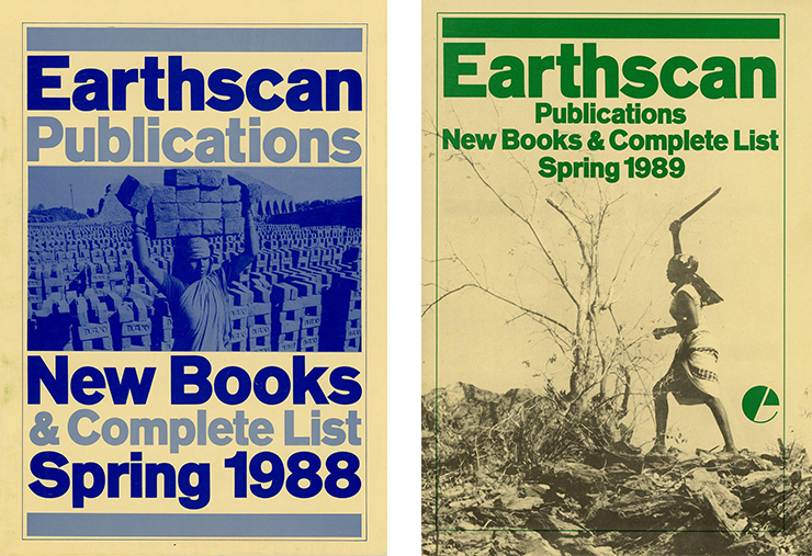
Earthscan was a subsidiary of the International Institute for Environment and Development (IIED), an independent policy research organisation founded in 1973. The publisher’s new books list for spring 1988 gives a concise mission statement: “Earthscan Publications Ltd publishes hard-hitting books addressing Third World problems and their global implications. This list and those to come take as their starting point the inescapable link between poverty and environmental degradation. So feminism as well as farming, human settlements as well as wild places, social and cultural questions as well as deserts, economics as well as environment will all be among the subjects we shall publish at popular and at academic levels.”
Judy Groves, King’s friend and regular collaborator, worked with him on the Earthscan titles from the start. She doesn’t remember there being any brief from Middleton, as managing director, about the look of the covers. “They trusted David to produce something bold and memorable.” Groves recalls Middleton as being the principal commissioner of cover designs. Middleton, King and Groves were friends and would meet socially. “David found this work both campaigning and political,” she says. “Most left-wing people did and he didn’t see it as a distraction from his own work. It was his own work and he really cared about the content.” Groves shared this commitment: “I was extremely enthusiastic and thought the subject matter highly important. Earthscan was very much ahead of its time.”

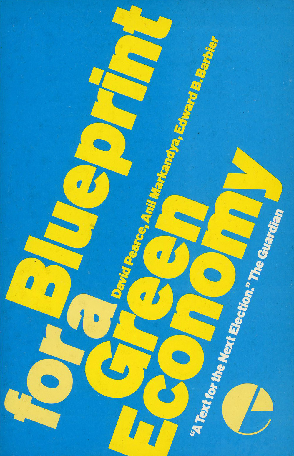
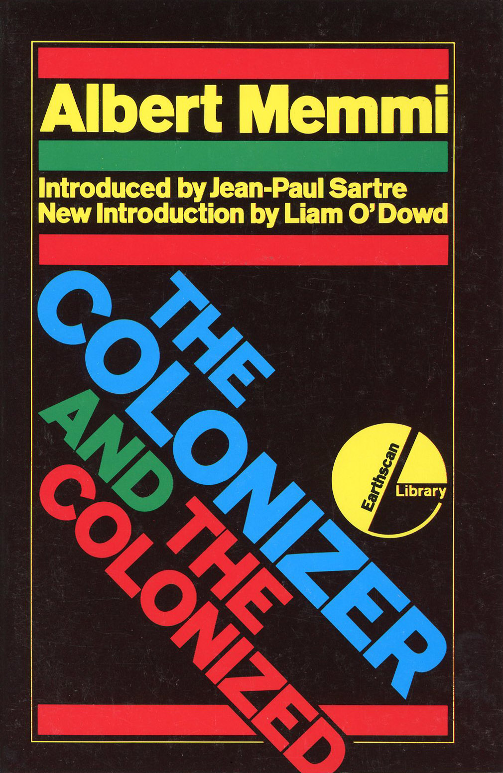
King’s choice of display typeface, Akzidenz Grotesk Ultra Bold, was muscular even by his usual standards, endowing the books with an unmissable heavyweight punch. Everything looks urgent and necessary, but there is so much variety to the designs that the effect is not repetitious or overbearing. The title is often set all in capitals, though not invariably, while the author’s name may be in upper and lowercase. With occasional centred exceptions, King’s type arrangements are mostly asymmetrical and frequently angled. In two of the earliest books, The Bhopal Syndrome (see David King: Designer, Activist, Visual Historian) and Saving the Tropical Forests (above) – both “Earthscan Originals” – the angled type plays against the lines in the photograph, forging a tight visual unity. The typographic mood is highly contemporary, giving the imprint an attractive image in the bookshops, even when the design of the interior pages (not by King) proves to be routine and dry. For the back cover copy, King uses Quorum Black, an offbeat type choice with a sharp-edged, non-European character that can stand up to the pushiness of Akzidenz Grotesk.

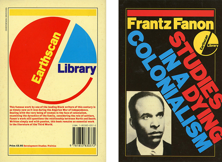
The typographic effect cannot be separated from King’s use of colour. In the course of the 1980s, working on City Limits covers and the pages of Crafts, his palette had brightened and become more playful. He favours vibrant primaries, which might at times seem implausibly upbeat for subject matter such as Studies in a Dying Colonialism and The Colonizer and the Colonized, though the backgrounds for this series of reprinted classics are a consistently sombre black, making the colours even zingier. The Challenge Road (below) is a study of women and the Eritrean revolution. According to the cover copy, “women have emerged from a semi-feudal world to participate fully in the fight for liberation, organizing cells, gathering intelligence, carrying out clandestine missions, setting up and running health and education systems and fighting on the front line.” King uses coloured bars to frame a self-possessed female resistance fighter holding a rifle. The device recalls the black bars around the dying boy in his famous “Apartheid in Practice: Law & Order” poster. Here, though, the bars aren’t accusations of racist persecution and violence against Black people, but transmitters of revolutionary autonomy and optimism.

While King isn’t known for logo design, his Earthscan “e” is distinctive and works at any size. Sometimes, as with the Earthscan Library variant, he employs the logo intrusively as a constructivist compositional element that can move around as required. The additional words within the logo’s shape add visual interest. King gets most mileage from the logo in the publisher’s seasonal book lists and on the books’ back covers, where he sometimes inflates the logo to become the primary focus. In an early example of what came to be called the “flexible logo”, he also changes the colour combinations. The logo works hard to set the imprint apart from other publishers.

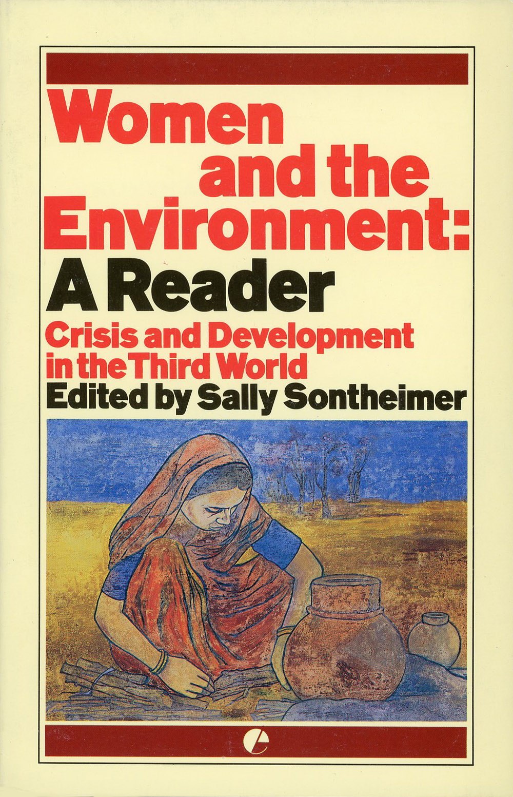
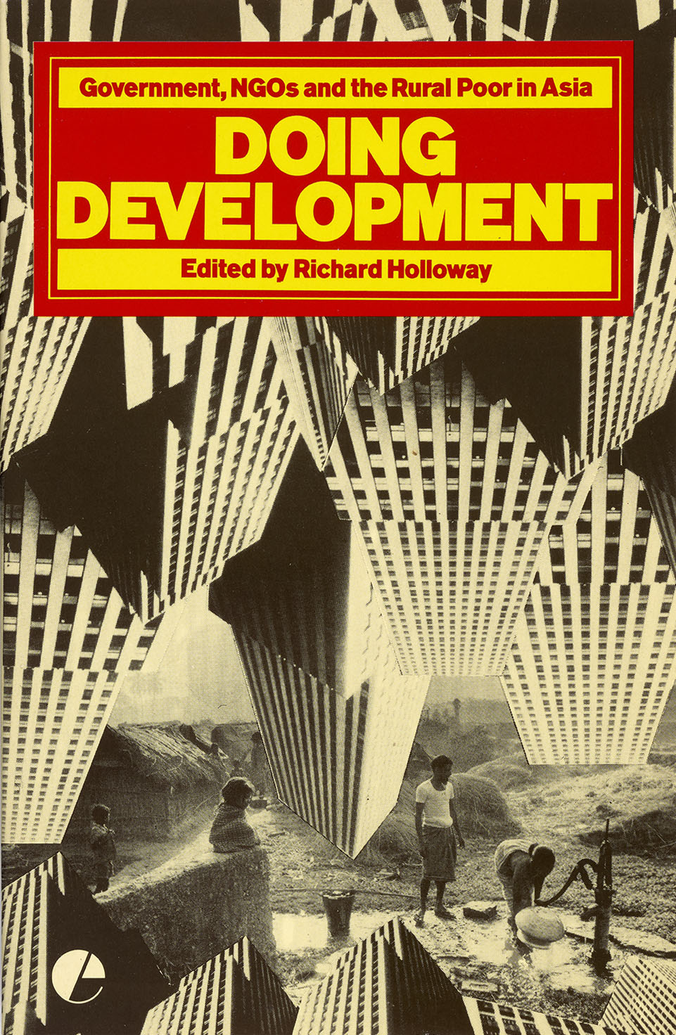
The cover images came from various sources. “Often the author would provide photos,” says Groves. “If there wasn’t anything strong enough, David would do a typographical cover, or ask me to do an illustration.” Groves’ drawings with added washes of colour are sensitive interpretations of the lives documented in surveys such as Women and Environment: A Reader (above). King made poignant use of documentary pictures, such as Raissa Page’s shot of an Indian woman in traditional dress working in a textile factory on Woman’s Role in Economic Development (top). He used other photographs, such as the barren expanse of rocks on Famine Early Warning Systems, more impressionistically; this full-bleed image of a land without sustenance envelops front and back cover (above). In an Earthscan series about environments and resources under human pressure – Water, Forests, Wetlands – King selected details from his own black and white photographs. Returning to photomontage, a favourite device, he created an unsettling angular construction of inverted skyscrapers, which threaten the people at the pump on Doing Development.
King’s relationship with Earthscan lasted only until 1991. A Bookseller obituary of Middleton notes that “he may not have been as attentive to balance sheets as he should have been” and “the new venture foundered”. King and Groves left at the same time as Middleton. The imprint lived on when it was acquired by Kogan Page and it is now owned by the Taylor & Francis Group, but King’s eye-catching cover concepts no longer determined its image. The Earthscan covers proved to be his final sustained commission of this kind. They fully reflect his humanistic values and political engagement as a designer.