Hemingway Covers For Penguin
Most of the book covers designed by David King were for political titles. He enjoyed a long and fruitful working relationship with David Pelham, Penguin’s art director from 1968 to 1979, and Pelham gave him a great deal of freedom. Less well known are the covers King designed for books by Ernest Hemingway, which were among his earliest assignments for the publisher. King tended to keep examples of work that pleased him, but we found no copies of the Hemingway titles in his house, although he did retain several trimmed proofs. The covers were also missing from the 35 mm slides he made of his work. Whatever King’s view of these covers in retrospect, the series has considerable graphic impact, while now looking entirely of its time.
In the 1970s, as a teenage reader, I bought a couple of the Hemingways – A Farewell to Arms and The Snows of Kilimanjaro – but it came as a surprise, decades later, to discover the scope of the series. There were 13 titles and 12 are shown here.* The earliest dates from 1969 when King was almost mid-way through his time at The Sunday Times Magazine. He had yet to go officially freelance, though he moonlighted on some high-profile projects, notably his album covers for Jimi Hendrix and The Who.

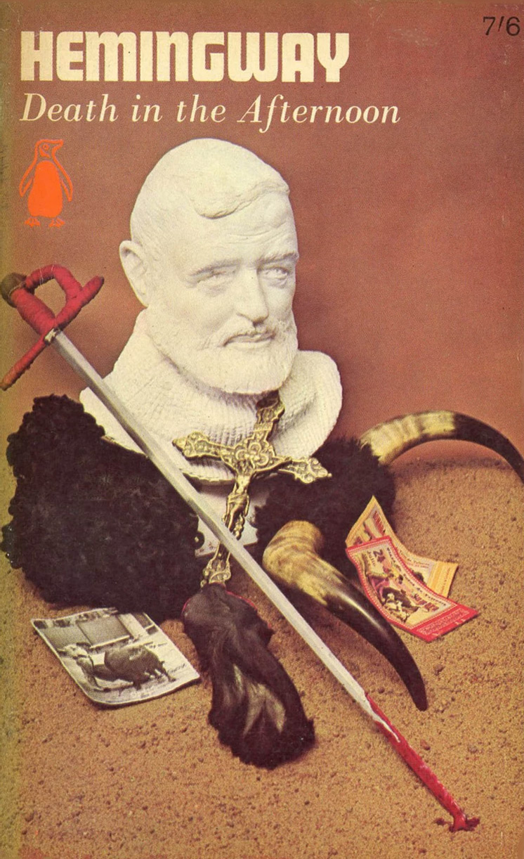
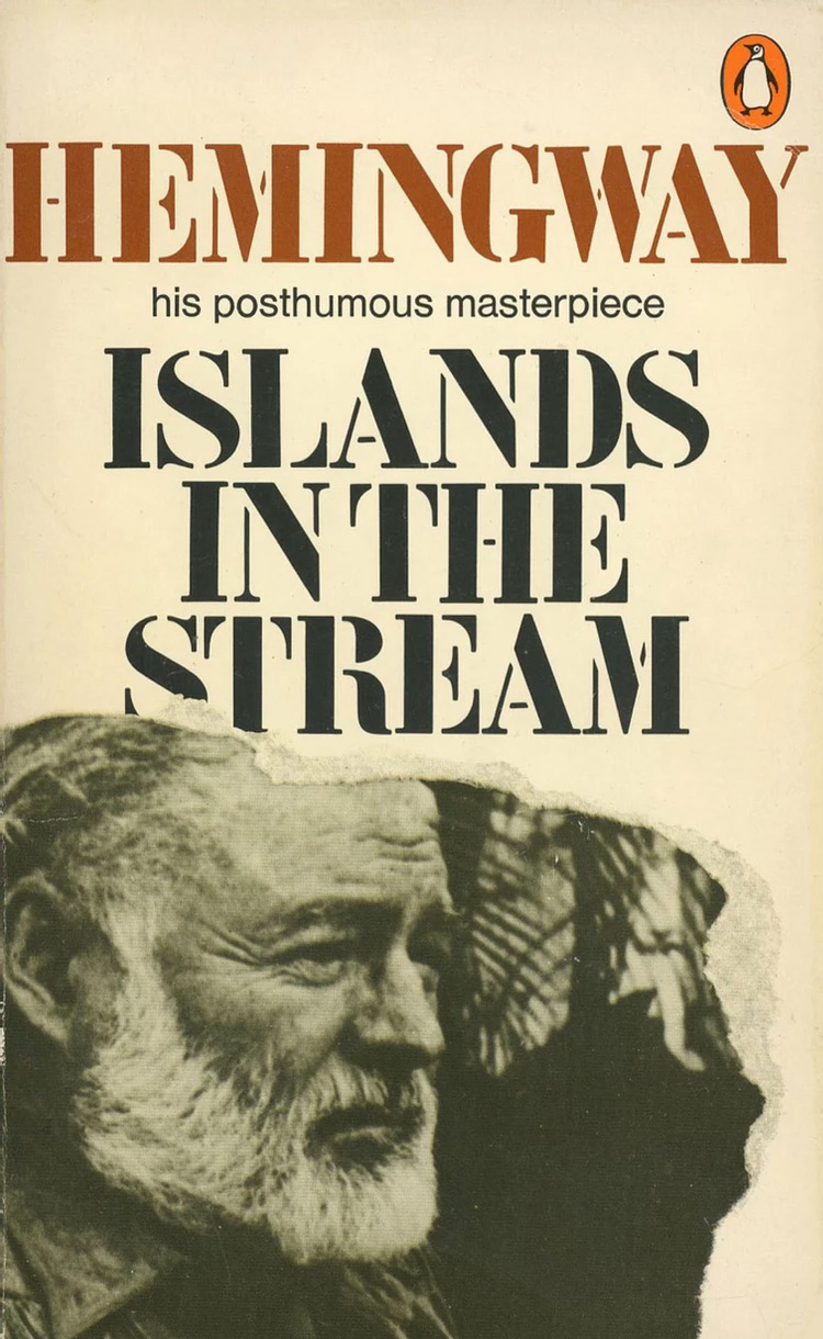
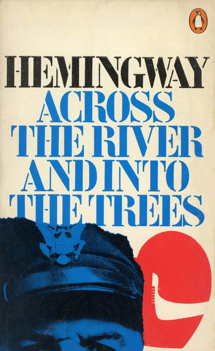
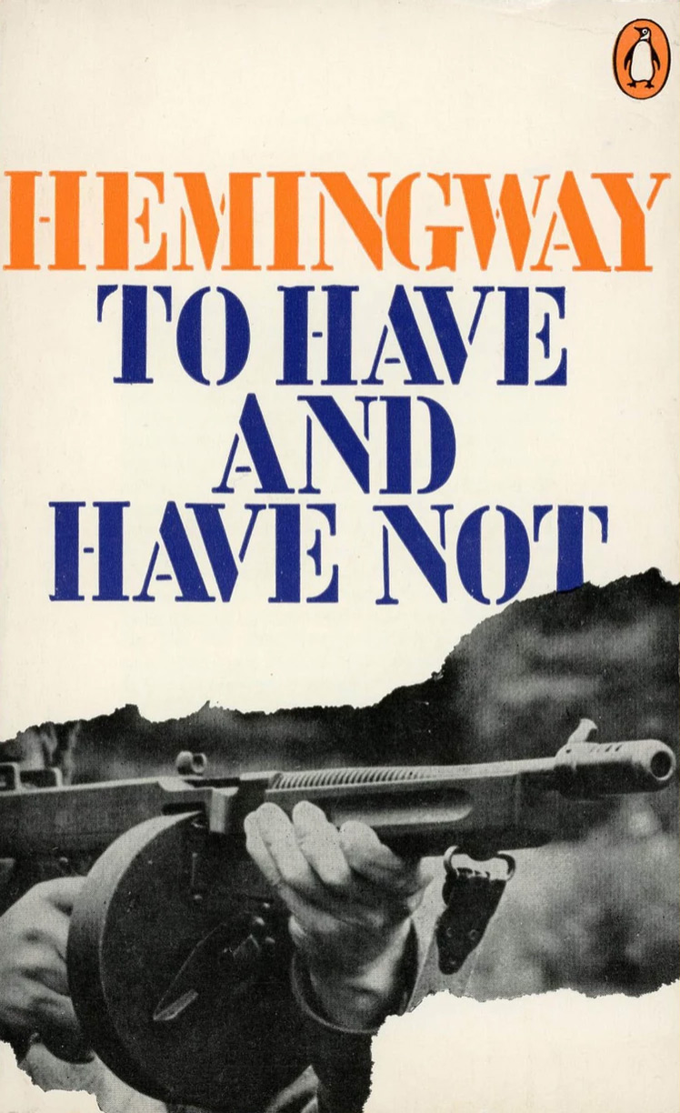
Pelham only vaguely remembers the commission. He admired King’s work at The Sunday Times Magazine and once he selected King for the series an assistant would have acted as liaison. King was influenced by Pop art in the 1960s and the covers are strikingly “Pop” in mood, as well as being a departure from Penguin’s previous rendering of Hemingway. In a mid-1960s series of six titles, each cover was based on a photograph showing a bust of the bearded American writer surrounded by objects related to the book – a wine bottle and glasses, a bull’s horns, a bloody sword, a baguette. While these advertising-like photographs were boldly contemporary and Pop in their way, the three-dimensional assemblages now look overly literal and too insistent on the author’s personality and image in their attempt to establish a unique series identity.
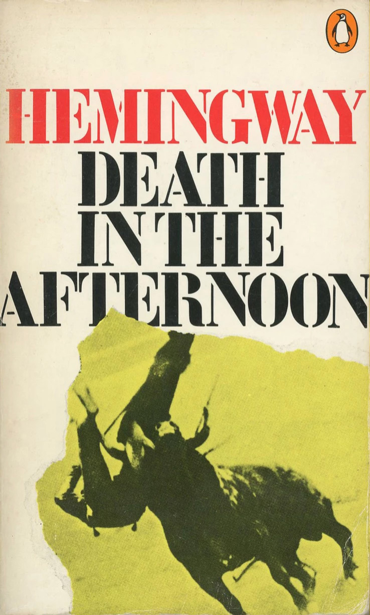
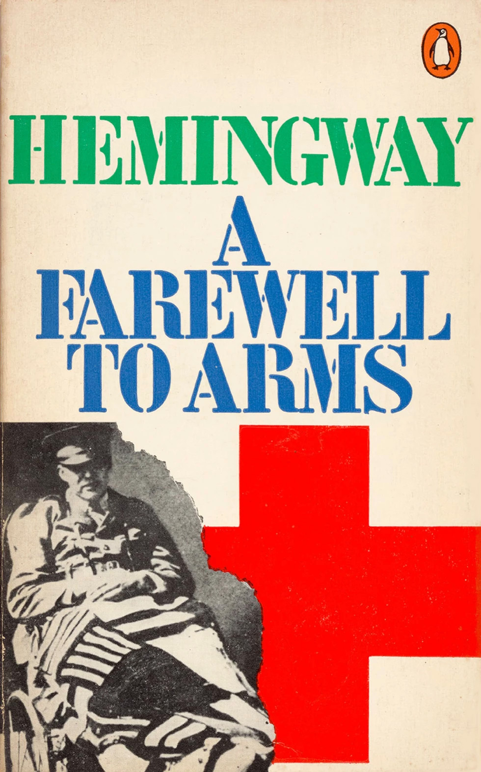
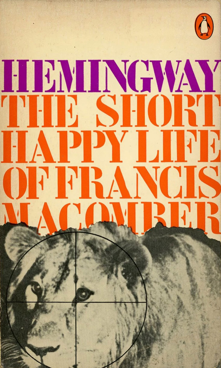
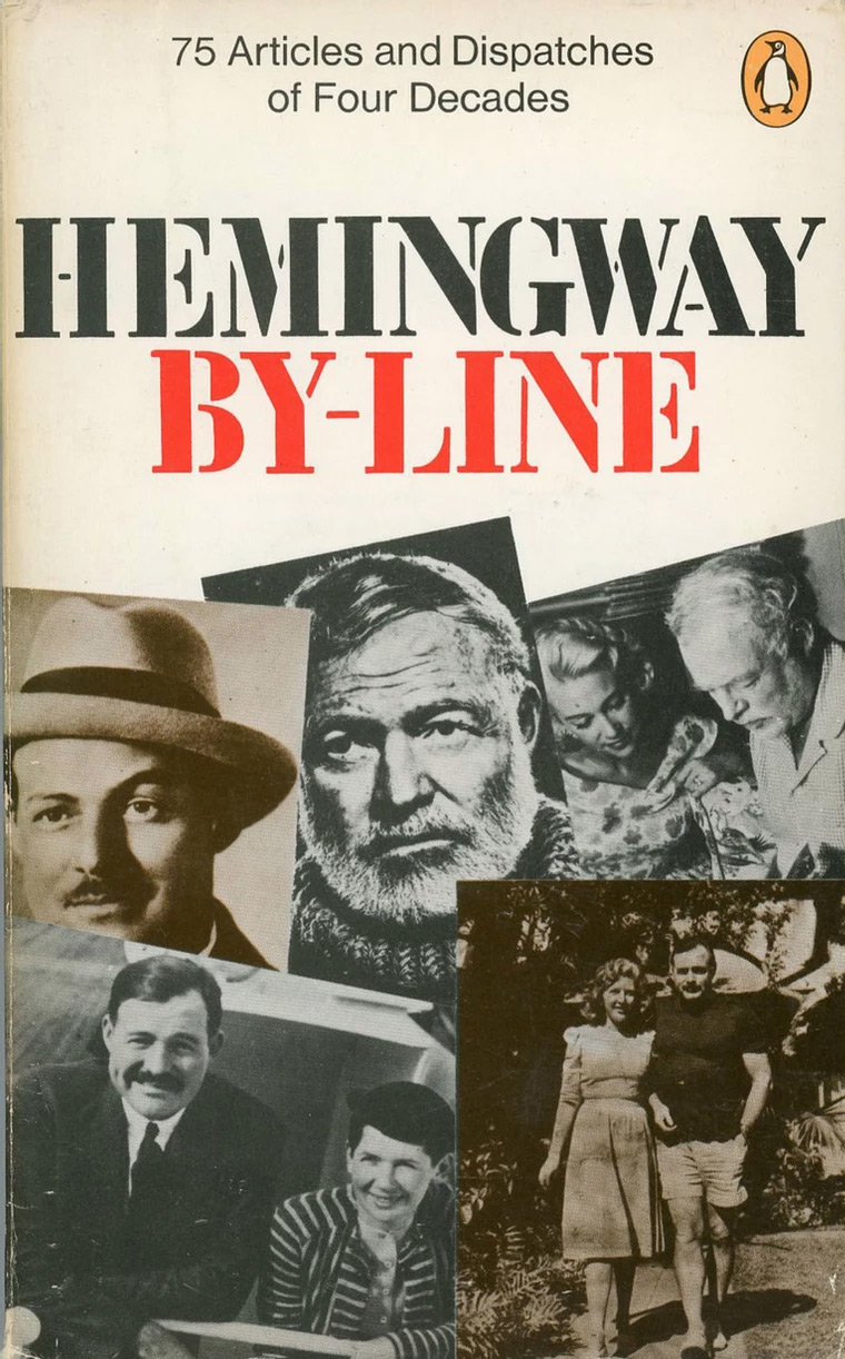
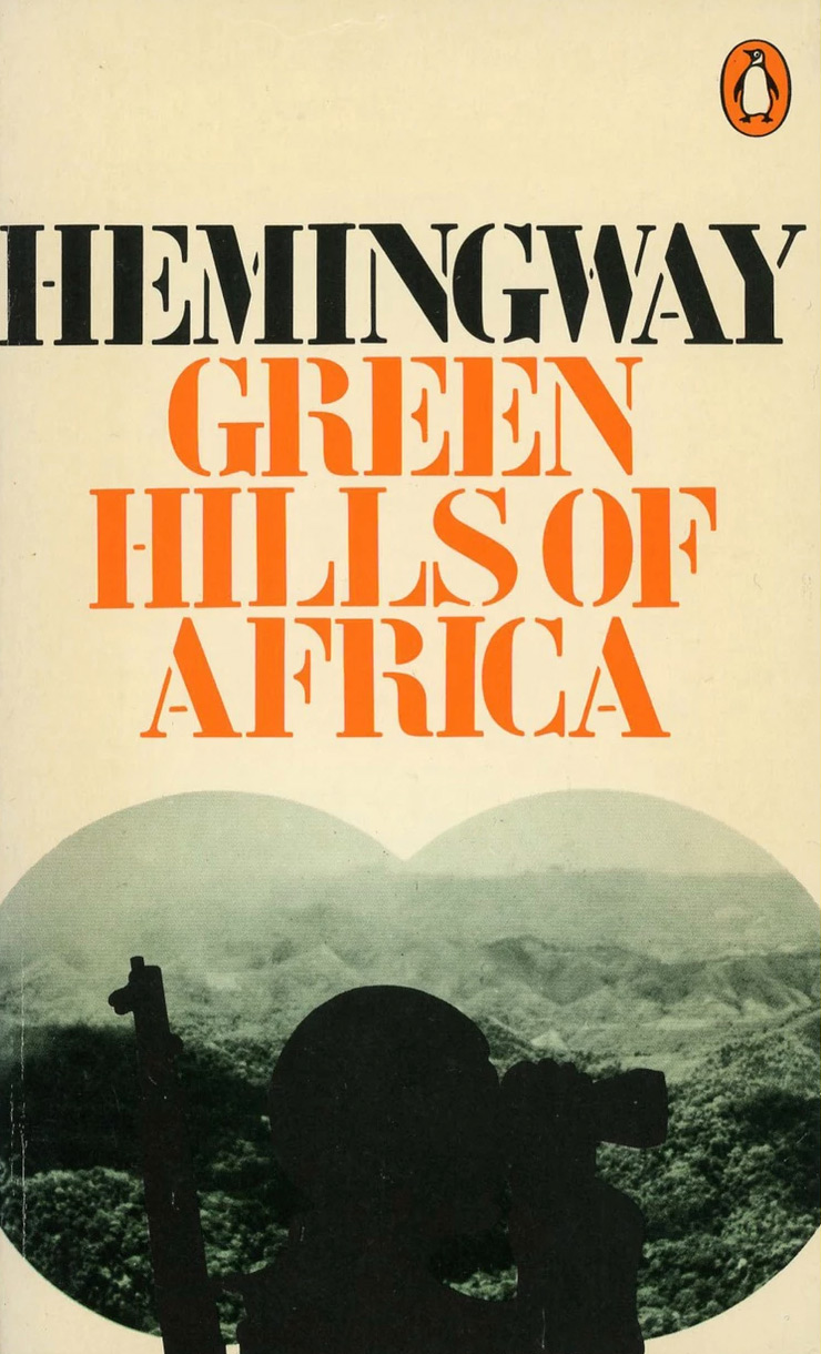
King’s approach is both decisive – he was congenitally decisive – and suggestive. The colourful stencil lettering centred consistently at the top compels the viewer’s attention. The letters are tightly spaced in the 1960s fashion, but they need to be so that “Hemingway” can be as large as possible. Only in the case of “Kilimanjaro” was King obliged to reduce the point size to fit the word within the measure. In The Short Happy Life of Francis Macomber, all five lines go to the full width (with a bit of forcing in the top line of the title), producing a barrage of purple and orange letters. On By-Line, the one instance where the title fills only a line, the cover looks more ordinary and unexcitingly sedate.
How the lettering was done remains unclear. Dry transfer lettering was routinely used at the time for display type, but there are reasons to doubt these are rub-downs. The letters are in the style known as French stencil; Le Corbusier was their most famous exponent. The mass-produced metal stencils were not hard to acquire at the time in France and the designer Richard Hollis owned a set. Around 1970, James Mosley, a historian of type, supplied Rapitype, a dry transfer company, with a set they used to produce French Stencil instant lettering – too late for these covers. Letraset’s Charette (Charrette in France) followed later still. But the King stencil is in any case slightly narrower than the Rapitype or Letraset versions. Hollis suggests these could be phototype letters supplied by a company such as Face. It’s also possible, he notes, that a photosetting house may have put the letters on a master negative, as they did for the Block lettering he used on posters for the Whitechapel Art Gallery.
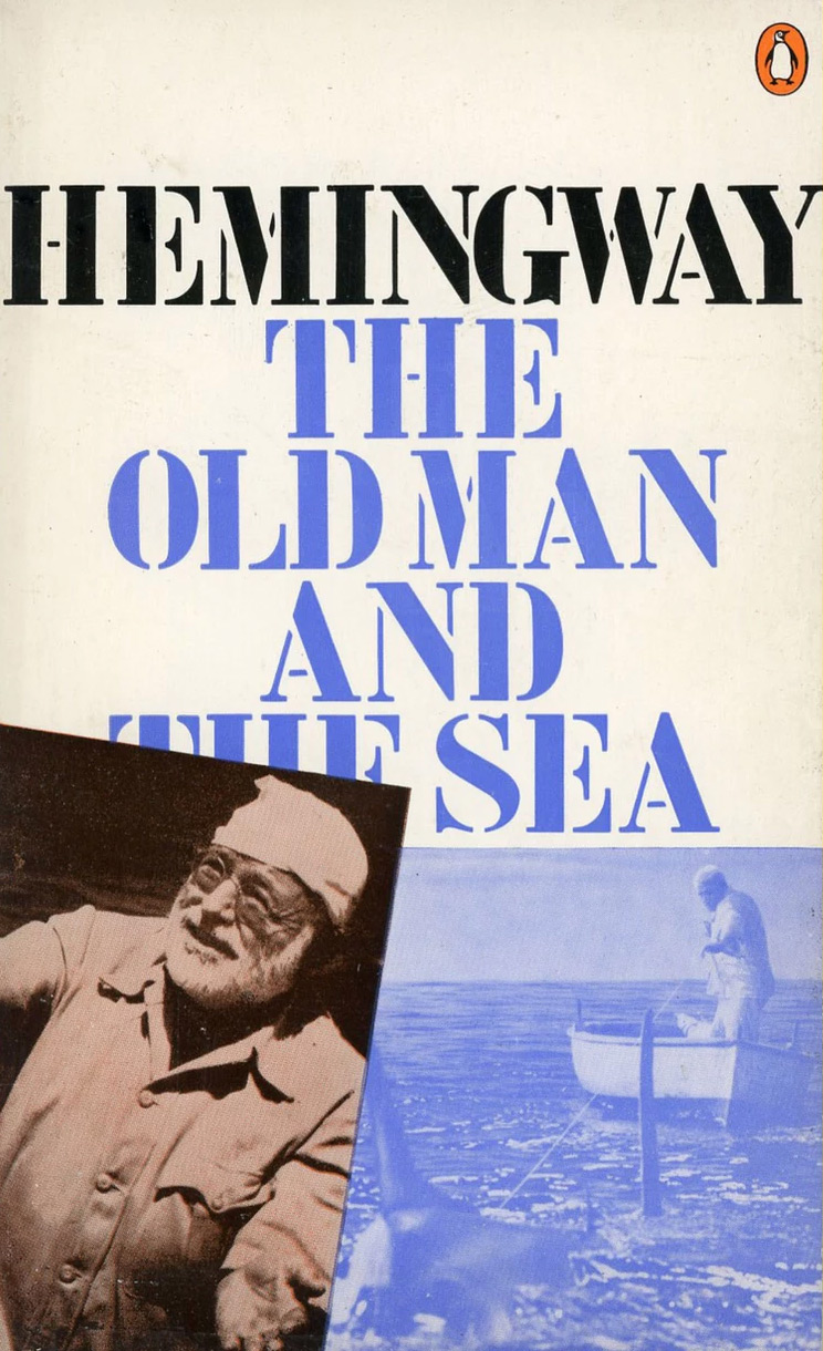
As Eric Kindel, an expert on stencils, points out, the lettering “struck just the right note for the series” with its references to military vehicles, ambulances and transport. “I imagine for the discerning – like King – it would have offered a Continental/French quality, in distinction to a British or American one, as with the ubiquitous ATF Stencil.” At the same time, the stencilled title-pieces have an informal, almost improvised character, accentuated by King’s casual handling of the whole design, which gives these mid-century texts, several of them classics, a feeling of contemporary relevance and necessity. Hemingway’s macho literary reputation has declined since this series appeared. A decade after his death in 1961, it may already have been fading. The covers do their utmost to reassert him as a vital and canonical figure for a new generation of readers.
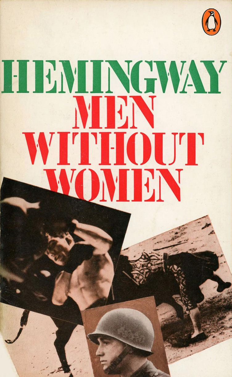
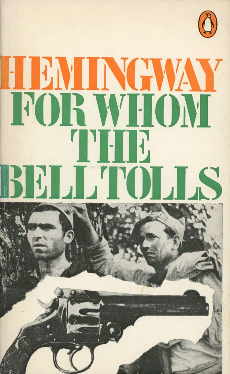
In King’s use of images, there are clear links to his work for The Sunday Times Magazine, where he specialised in stories built from grainy historical photos and raw news images. Where the previous series of covers assembled props like a shop window display, King offers only fragments to evoke the world of these narratives: a recovering officer in a wheelchair, a bull tossing a matador, a revolver to encapsulate the violence of the Spanish Civil War. He sets pictures at angles, allows them to obscure portions of the lettering and rips their edges to convey emotion, urgency and the transitory nature of experience. The torn edge would become a familiar trope a few years later in punk graphics, but in book cover design it was still unusual, all the more so when applied to a Nobel Prize winner’s oeuvre. By-Line’s scattering of five pictures from the archive is typical of King the visual journalist, but less resonant than the more stripped-down covers, because it supplies too much visual information.
Four of the covers shown here have no credit for King on the back: Death in the Afternoon (1971), Across the River and into the Trees (1972), Green Hills of Africa (1972) and Islands in the Stream (1972). There is no reason to think Pelham would have given them to anyone else to design and King kept a trimmed proof of Islands, implying it was his work. Green Hills, with its displeasingly symmetrical binocular image shape, is the weakest in the series. In the covers I have collected, only one, a reprint, was published later than 1972, so the project spanned three years. For King, the Hemingway covers are transitional designs. They grew naturally from his visual journalism at the Sunday Times, which would continue until 1975, while their confidence and pleasure in an assertive typography not possible at the ST points towards the commanding displays of type that would soon follow in King’s designs for political posters.
* Not shown: A Moveable Feast
** The other titles were: A Moveable Feast, Green Hills of Africa, Across the River and Into the Trees, The Torrents of Spring, The Fifth Column, all published in 1966
Thanks to Eric Kindel and Richard Hollis for their help