Designs For Album Covers And Music

David King’s handful of designs for music suggest an alternative career path he might easily have taken in another life. Music was important to him. He played acoustic guitar and sang. He was devoted to Dylan; he saw the singer live and bought bootleg albums of his concerts. He liked Janis Joplin, Otis Redding, the Temptations, the Byrds, Country Joe and the Fish, and the Rolling Stones. He loved Jimi Hendrix. One night in the late 1960s, strolling in New York, King chanced upon the wild sounds of Hendrix jamming at the Generation nightclub with Paul Butterfield and Brian Jones among others. “We went in for about six dollars and the place was completely empty with about twenty-five or thirty people there,” he recalled. “They played this incredible music – there he was setting fire to his guitar on stage, biting the carpet.”
He admired the jazz keyboard improvisations of Thelonious Monk and he enjoyed classical music. Later in his life, he loved going to English National Opera productions; Benjamin Britten’s Peter Grimes was a favourite. Dmitri Shostakovich – the perfect composer for King – was even more crucial for him. He wanted to do a book about the Russian pianist Maria Yudina, celebrated for her genius, although it never happened.
King went straight in at the top as an album cover designer. He’d been at The Sunday Times Magazine for only two years, but he was sitting pretty at the epicentre of fashionable London publishing. Chris Stamp, boss of Track Records, approached him and his friend, the illustrator Roger Law, who also worked at the magazine, to design some covers. So far as I know, King was only interviewed once about these early projects for a published article – by Malcolm Stewart, a features editor at Jimpress, a zine devoted to Hendrix (no. 65, October 1999). I draw on this interview here. Jeff Gold, an American music business executive and former cover designer, visited King in 2013 and, in an obituary, declared him “the finest album cover designer ever.”
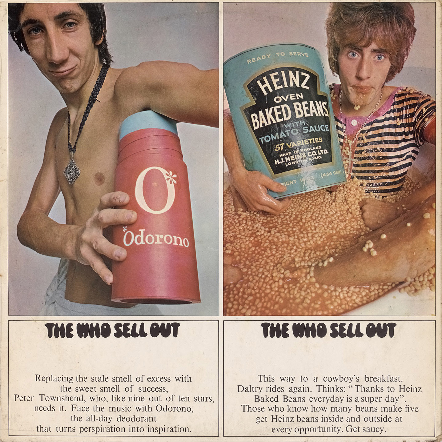
King and Law’s first collaboration, in 1967, was for Axis Bold as Love by the Jimi Hendrix Experience. They found a religious painting – “It was Indian pop art, really. Probably got it in Brick Lane or somewhere,” King told Jimpress – and superimposed faces of Hendrix and his bandmates on the deities. Hendrix thought the image disrespectful and it doesn’t, in retrospect, seem very King-like in conception, despite the album’s classic status. His next three covers, featuring photographs by David Montgomery, who worked for him on ST magazine stories, are closer to his photographic concerns at the time as an art editor and visual journalist. In King’s second design assignment with Roger Law on the cover of The Who Sell Out (1967), the pair satirised the culture of trendy advertising and celebrity product endorsement, an audaciously disenchanted image for the usually upbeat pop milieu.
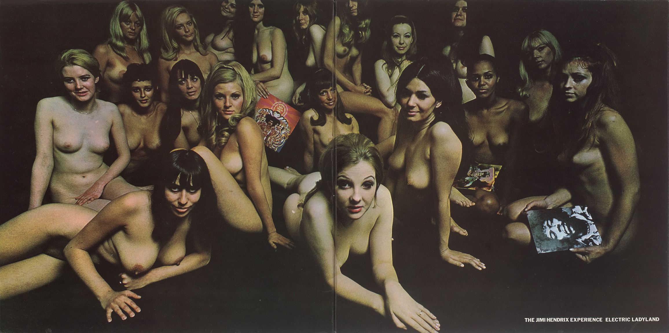
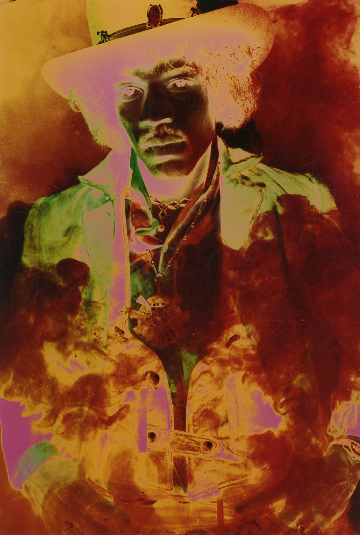
In King’s later account, a satirical purpose also appears to have motivated the Electric Ladyland cover (1968), which became instantly notorious and was soon replaced. “It was all David King’s idea,” Montgomery insisted to Jimpress. “I just did the photograph … Jimi never showed up and that’s what we ended up with.” King explained his thinking: “In Playboy, everything was retouched, every hair in place, and everybody looking terribly plastic.” To counter this, he wanted the women to look natural and real, which they do, but served up on a glossy album cover they also look uncomfortably like members of the rock star’s sultry “lady land” harem. They brandish tokens of adoration: a copy of Axis and photographs of the guitarist, one of which has a psychedelic treatment by King of the Montgomery portrait emblazoned across the inside cover.
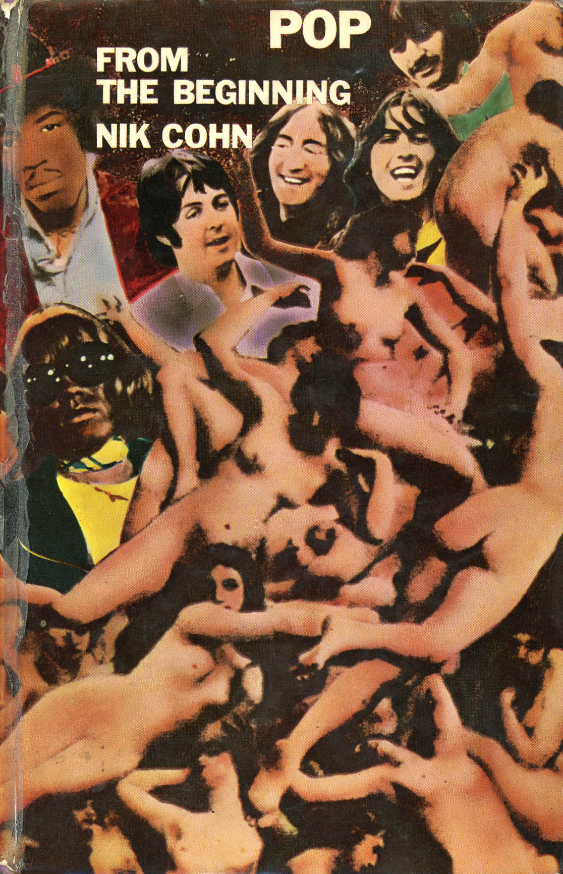
The following year, King returned to this pulchritudinous theme for the cover of Nik Cohn’s precociously racy and incisive Pop from the Beginning (retitled Awopbopaloobop Alopbamboom for the paperback, which has a different cover). King’s selection as the designer needed for this gig is further evidence of his pop world cachet at the time. On the long-lost hardback’s cover, not his best, he envelops the young gods of rock – the Beatles, Hendrix, Stones and, less obviously, Frank Zappa – with a writhing host of voluptuous Victorian nudes, seemingly chosen to represent the stars’ female admirers. King reflected the book’s pop-crazed but often waspish narrative by lampooning the spectacle of adoring fandom.
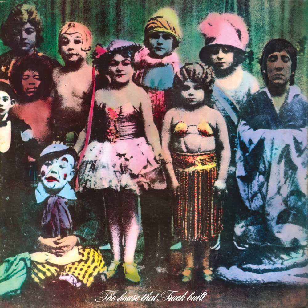
His other covers for Track in these years embrace a garish psychedelia. The Crazy World of Arthur Brown(1968) has a nightmarish close-up by Montgomery of a demented clown, and King shrinks the title down to a tiny red “iris” on a pink star, like the type itself is on dope. It was another high-profile project – the album went to no. 2 in the UK record charts. Electric Ladyland, originally a double album, was split into two separately sold discs and King montaged a hallucinogenic science fiction planet-scape for part 1 (1968) – in my view his best cover. In 1969, Track released a compilation album decorated by an antique photo of circus people of short stature. King transplanted the heads of Hendrix, Arthur Brown and Pete Townshend onto the figures. Like many covers of its era, the curious hand-tinted tableau is a lurid reminder of head-scrambling drug trips, inventive thrift-shop fashion and a new world of heavily amplified electronic sound. Equally strange, looking back now, is King’s Badfinger cover (1970), although its surreal manipulation of scale has something in common with The Who Sell Out.


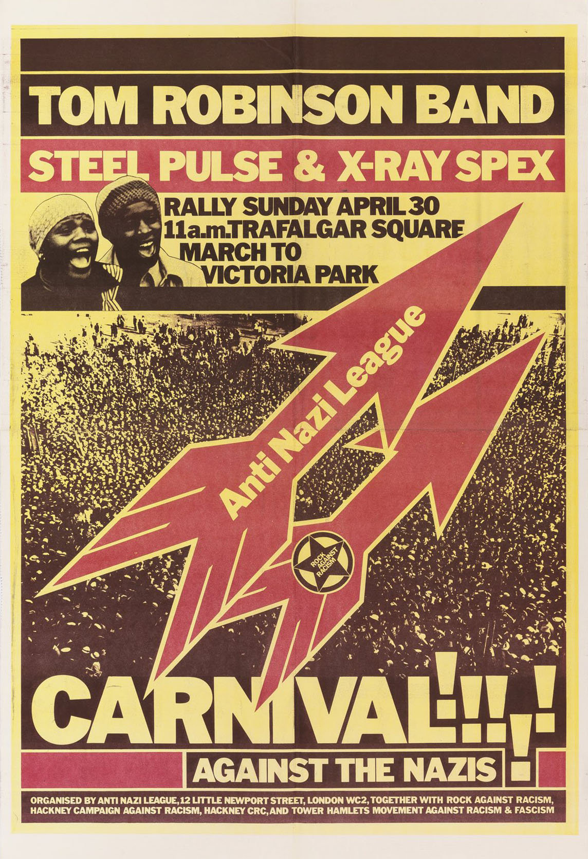
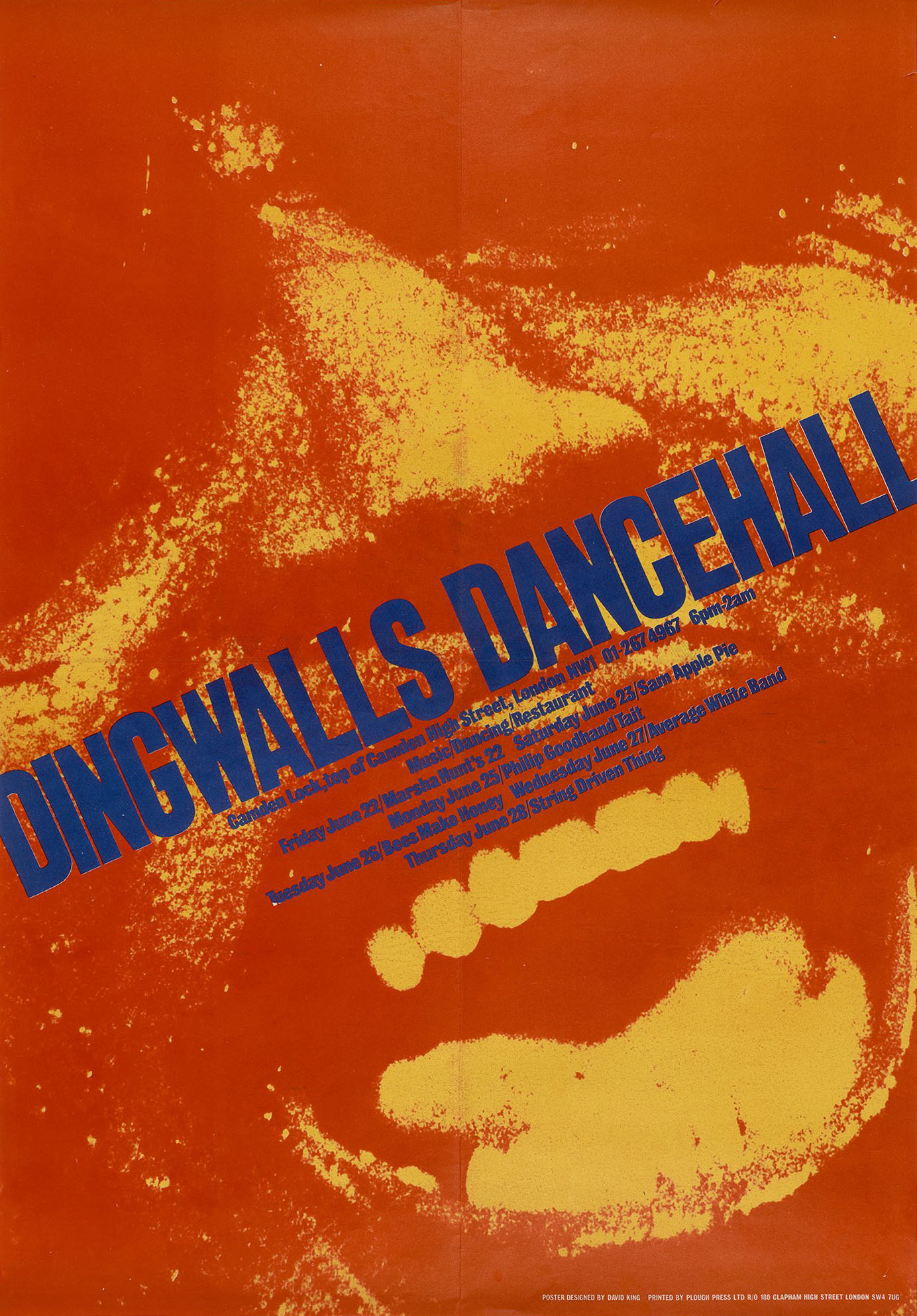
King’s moment as a groovy 1960s music designer was short-lived. In 1973, in a brief comeback, he designed a poster for the Who’s “Fallout Shelter” North American tour. The standard fallout shelter graphic – three yellow triangles in a circle – anticipates the punchy direction his activist graphics would soon take; he reused the symbol on the cover of Windscale Fallout (Penguin, 1978). King’s interest in Russian history was rapidly developing and book covers provided a better outlet than album covers for his visual and historical concerns. In 1976, his involvement as a visual activist with Rock Against Racism and then the Anti-Nazi League (see my discussion in David King: Designer, Activist, Visual Historian) brought him back into the orbit of the pop scene. His four Carnival posters are key visual documents of these anti-racist protests by music fans on the march. The poster for Dingwalls Dancehall in Camden is also classic King: a massive crop (photographer unknown) meets urgently angled typography, and there is more than an echo of crazy Arthur Brown, although rapture triumphs here over menace.

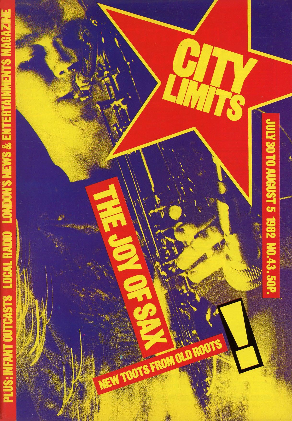
In collections of music graphics from this period, King’s posters jostle against pieces by designers from the punk scene (see, for instance, Oh So Pretty: Punk in Print, 1976-80). It’s sometimes wrongly assumed that he was a punk designer, but he didn’t care for punk rock; it wasn’t his scene. He is occasionally confused with another designer called David King, who worked with Crass, a British anarcho-punk band. Designing covers for the radical London listings magazine City Limits, in the early 1980s, it was inevitable that King would need to interpret musical material. His subjects included Elvis Costello, Elvis Presley, Marianne Faithfull and J. Walter Negro, who was also a graffiti artist. One of the most striking covers is “The Joy of Sax” (CL, no. 43), where King fits dynamic cover lines around the sax player as the image dissolves in a flare of light, a beguiling blend of hard and soft.

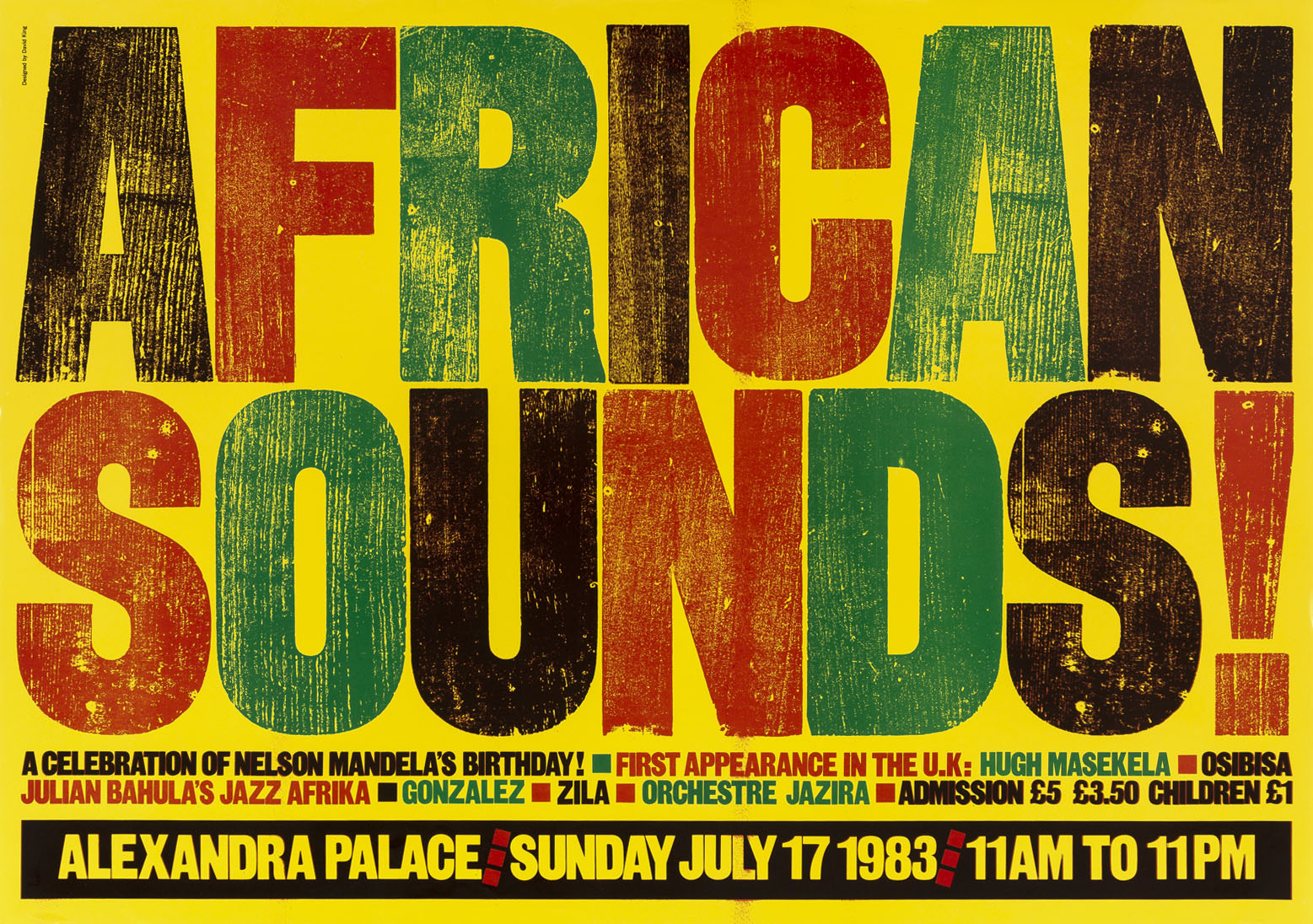
In his graphic interpretation of Mari Wilson, “Neasden’s Queen of Soul” (CL, no. 26), King arrives from a different direction – Russian constructivism – at a pop-cultural style exactly consonant with the era’s flourishing, vibrant “new wave” in music and graphics. A vertical band of red Letratone dots recalls his use of these optical graphics for the Mayakovsky: Twenty Years of Work catalogue around the same time (see this post). With some rejigging, it could easily have become an album cover, but King’s activism and interest in Russian visual history had by then taken him far away from the latest pop. His “African Sounds!” poster (1983) for a concert by the South African trumpeter Hugh Masekela, the Ghanaian-English band Osibisa and other African musicians is a joyous adaptation of the eye-smashing agitprop style he more usually wielded for full-on street protests.
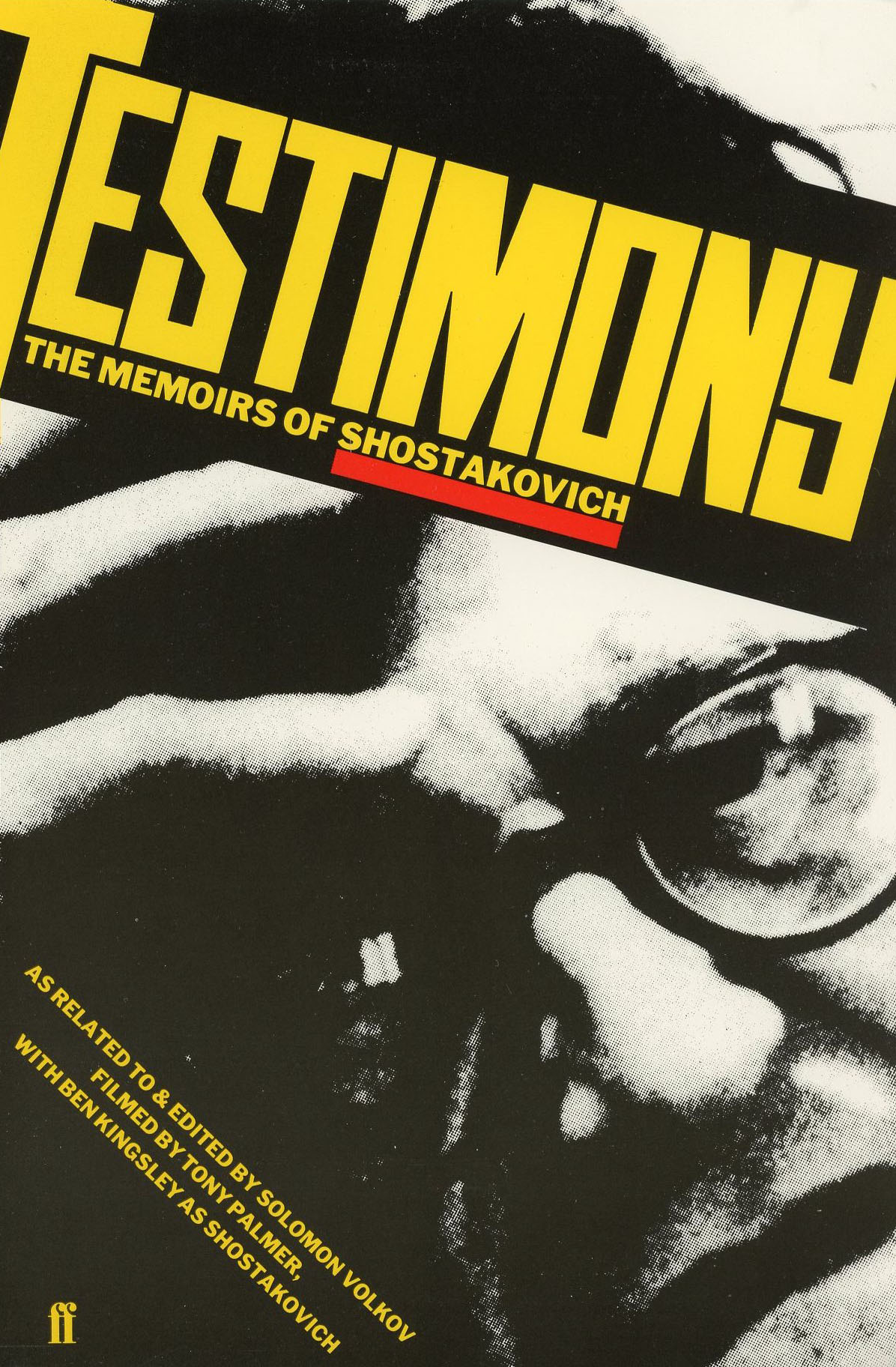
After that there was no music in King’s graphic world until, in 1987, he designed a cover for a reissue of Shostakovich’s controversial memoirs, Testimony, which the director Tony Palmer had transformed into a feature film. King’s blocky, constructivist lettering collides with the composer’s anguished hand and brow, and his crop bites into Shostakovich’s features as decisively as ever. King could always squeeze the maximum emotional and dramatic impact from a face. He did it again, 12 years later, with the horrifying obliterated non-face he used for the CD of Michael Nyman’s The Commissar Vanishes (1999), a score based on King’s masterly visual investigation of the falsification of art and images by Stalin, the remorseless Soviet dictator. This last piece of music graphics for a spin-off from a project so close to his heart was a fitting end to King’s occasional appearances as a music designer.

Thanks to Judy Groves and Valerie Wade for their help.