Charlie Chaplin: A Life Montaged
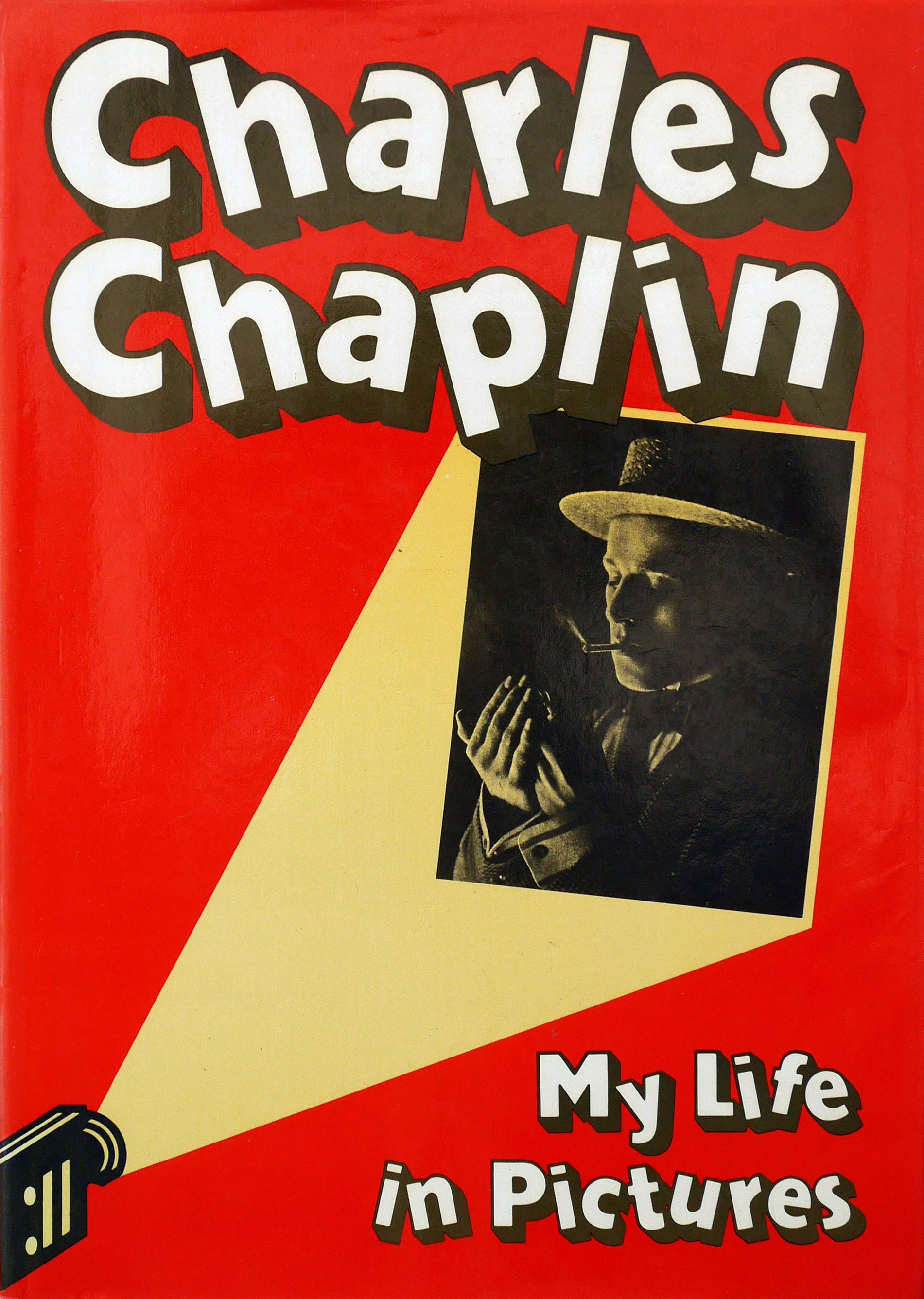
I was unsure whether to include Charlie Chaplin’s pictorial autobiography My Life in Pictures in my David King book and decided against it in the end. The project is interesting partly because it has been overlooked by King’s admirers, while King himself appears to have been indifferent to this early work, which fell outside his later interests. It wasn’t among his other book projects found in his house. I only discovered its existence part way through my research, though it will be familiar to many Chaplin fans and used copies of the British and American editions aren’t hard to find.
But there wasn’t space to show My Life in Pictures properly and do it justice, and without sufficient explanation it could appear to be an anomaly in King’s early body of work. What has a pictorial autobiography of a film star got to do with the anti-racist posters and the history of the Russian Revolution for which King is known? The Chaplin book is one of the last expressions of King’s first phase as a designer. When it appeared in 1974, he was still working for The Sunday Times Magazine. This kind of glamorous and showbiz subject matter had always attracted him during his years as a necessarily eclectic art editor and visual journalist.
In terms of its visual approach, the project fits perfectly logically between King’s first book, Trotsky: A Documentary (1972), and I Am King (1975), his photographic biography of Muhammad Ali. As with the Trotsky book, the assignment was a collaboration with King’s Sunday Times colleague and writer friend, Francis Wyndham, who wrote a stylish and insightful introduction. The magnitude of Chaplin’s superstardom and his iconic cultural status in the 20th century can be gauged from Wyndham’s effusive first paragraph: “No artist since Charles Dickens has combined the widest popular success with the highest critical acclaim in the way that Chaplin has.”

Although the book, published by The Bodley Head, is clearly attributed to Chaplin on the title page – “My Life in Pictures by Charles Chaplin” – the book’s actual authorship is ambiguous. Chaplin was 85 when it appeared and he died three years later. He wrote brief first-person caption commentary for many of the images, which come from numerous credited sources, including the Chaplin family archives. It’s doubtful Chaplin compiled the book’s five-page filmography and it isn’t made clear who did. There is no formal credit for picture research, nor is any editor credited, and Wyndham, like King, has gone.
However, an article about the genesis of the book by Wyndham, published in The Sunday Times Magazine (13 October 1974), provides some information. Wyndham first discussed the possibility of a book with Chaplin in 1972, during a meeting at Chaplin’s house in Vevey, Switzerland. They agreed that this follow-up to his earlier autobiography “should take an almost exclusively pictorial form” and cover all of Chaplin’s career. “Picture research on Charlie Chaplin is both an easy and a difficult task,” writes Wyndham, “because of the enormous quantity of available material, much of it mediocre in quality.” A friend introduced Wyndham and King to an obsessive collector of Chaplin memorabilia in Paris – Simon Dargols – who agreed to supply numerous photos (he is the first person in the acknowledgements). On a visit to Chaplin’s house, in the cellar that held his archive, Wyndham and King discovered scrapbooks about his career compiled by both Chaplin and his fans, and call-sheets that gave day-to-day details of his films. Chaplin had no idea they were in his possession.
In addition to Wyndham’s article, there is one piece of direct evidence from King’s files. While it is no longer possible to determine how crucial decisions about the book’s visual contents and structure were made, Chaplin and his representatives were clearly involved. On 11 May 1973, Wyndham sent King a telegram in New York: “Chaplins love dummy and say go ahead.” Gilvrie Misstear (now Lock), who worked with King as a designer on The Sunday Times Magazine, also played a role in the book. She recalls only that she had the task of shaping and fitting Chaplin’s captions, which is standard practice on magazines. (The late Claudine Meissner, another ST designer, also helped with design tasks.)

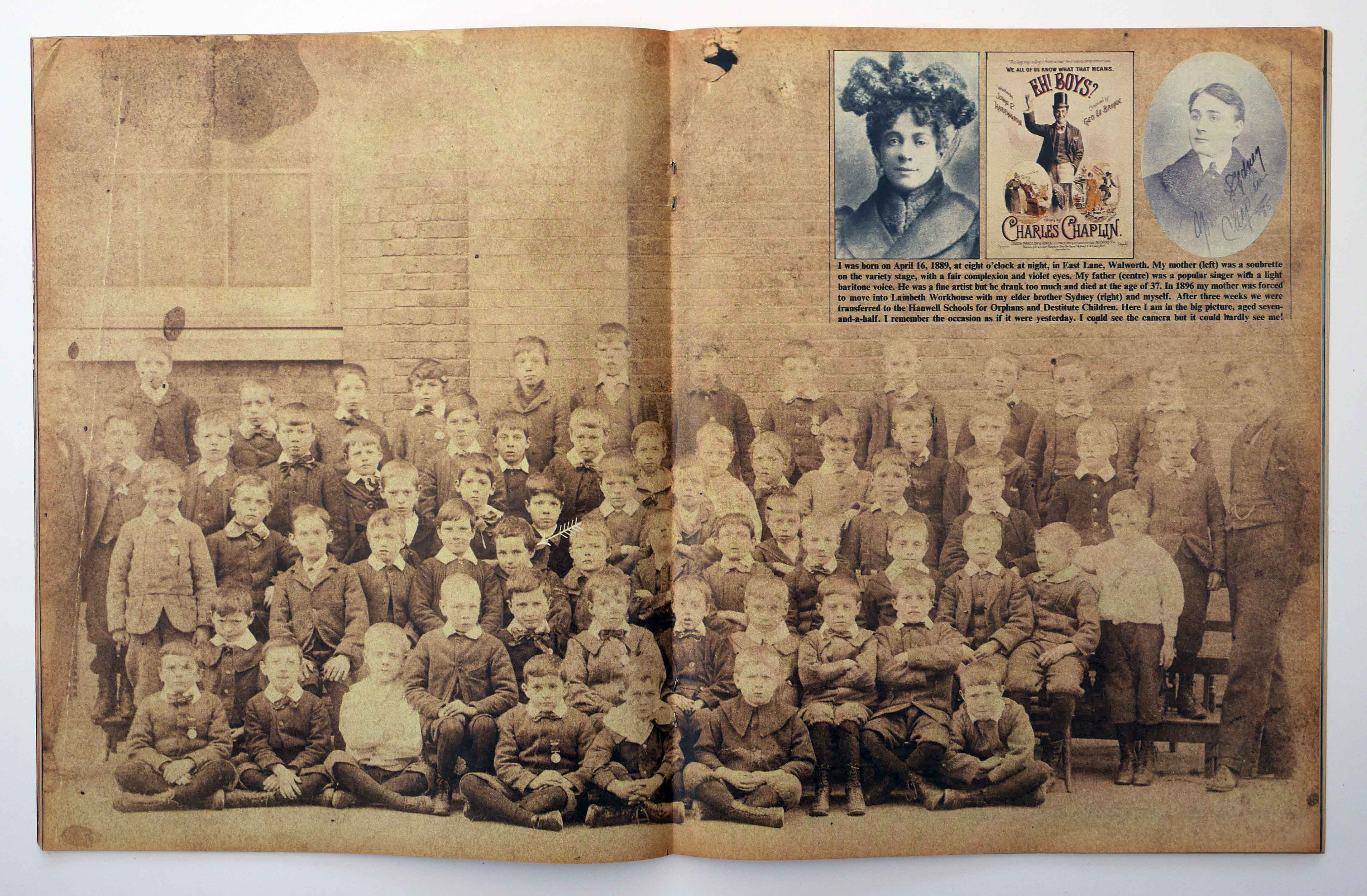
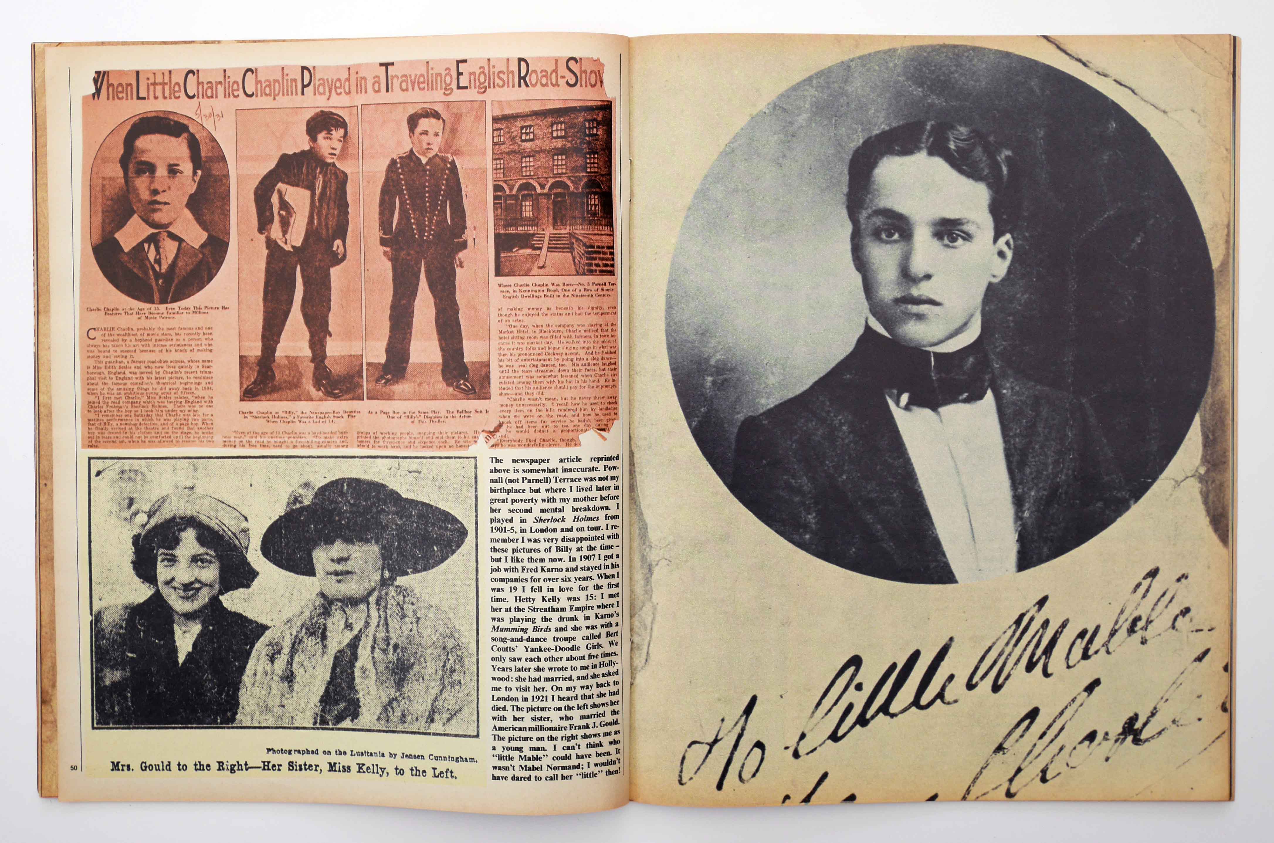
King’s design credit is extremely prominent compared to most books, equal in size to Chaplin’s by-line and placed above Wyndham’s on a spread that replicates the title spread, which is based on Charlie the tramp’s two old boots (the contents spread is similar). This feature alone would make it reasonable to suppose that King played a large role in organising the book’s mostly visual contents. But this is also a book in which the treatment of hundreds of visual elements – the book’s form – is crucial to what it is. Indeed, the first chapter, “The Chaplin Image”, is entirely pictorial, a visual essay in effect, and many other pages consist only of images. Since the picture-led layouts closely resemble the kind of pages King had produced for nine years at the Sunday Times, as well as in the Trotsky book, one might assume him to be the picture book’s unnamed co-author. A year later, I Am King, solely authored by King, pushed these techniques even further and they can be found in other books he went on to author.
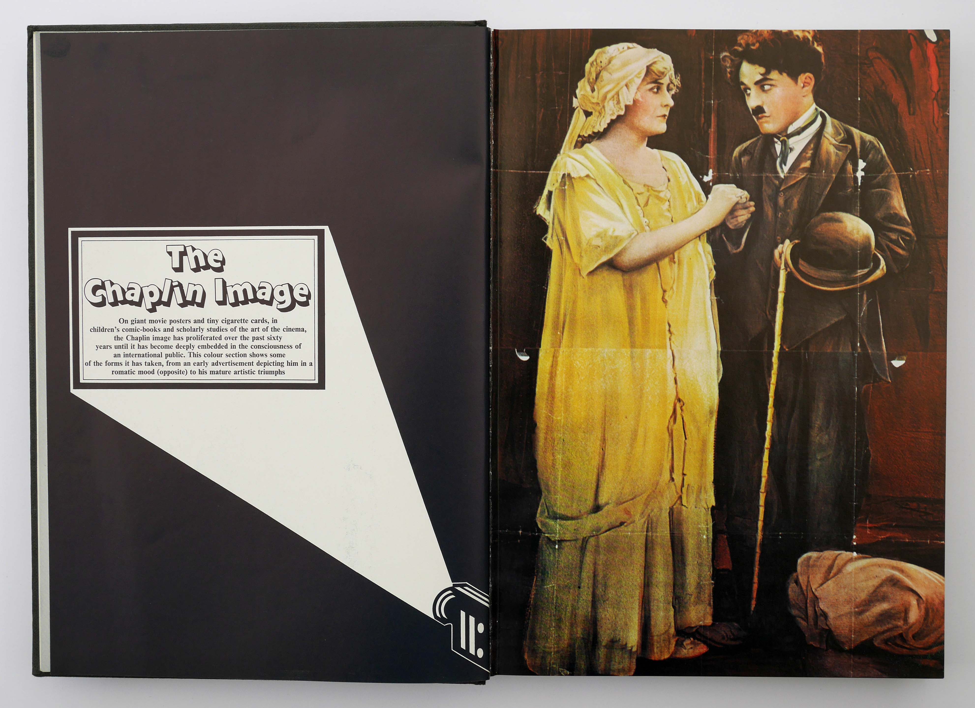
King’s typographic framing of the project is jocular, reflecting the subject’s universal popularity, irreverence and humour. The dancing drop-shadow letters are unique in the designer’s output. He repeats the stylised projector and screen motifs used on the front and back of the first edition hardback’s jacket (they were replaced on other editions) for each of the book’s eight sections.
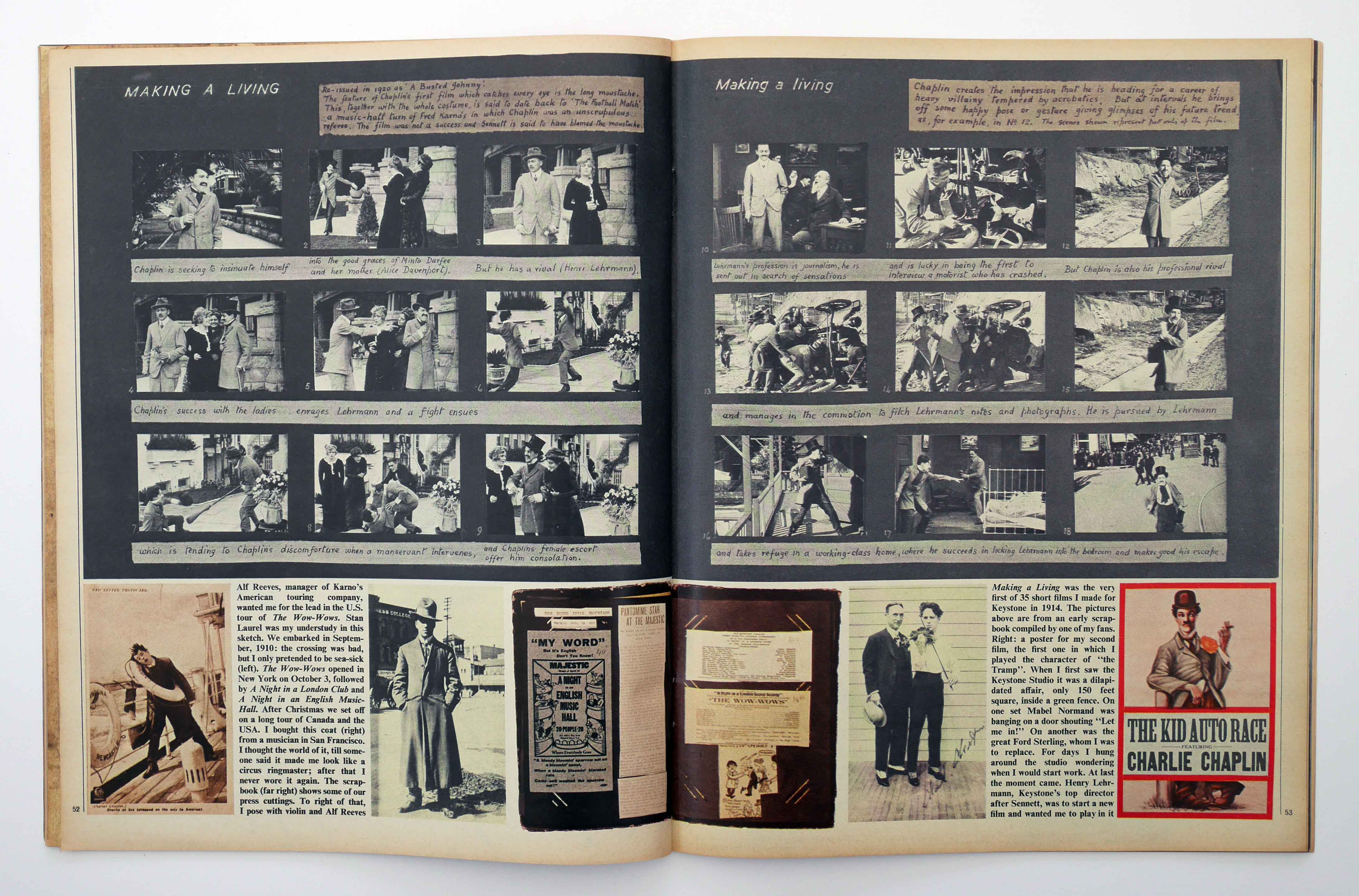
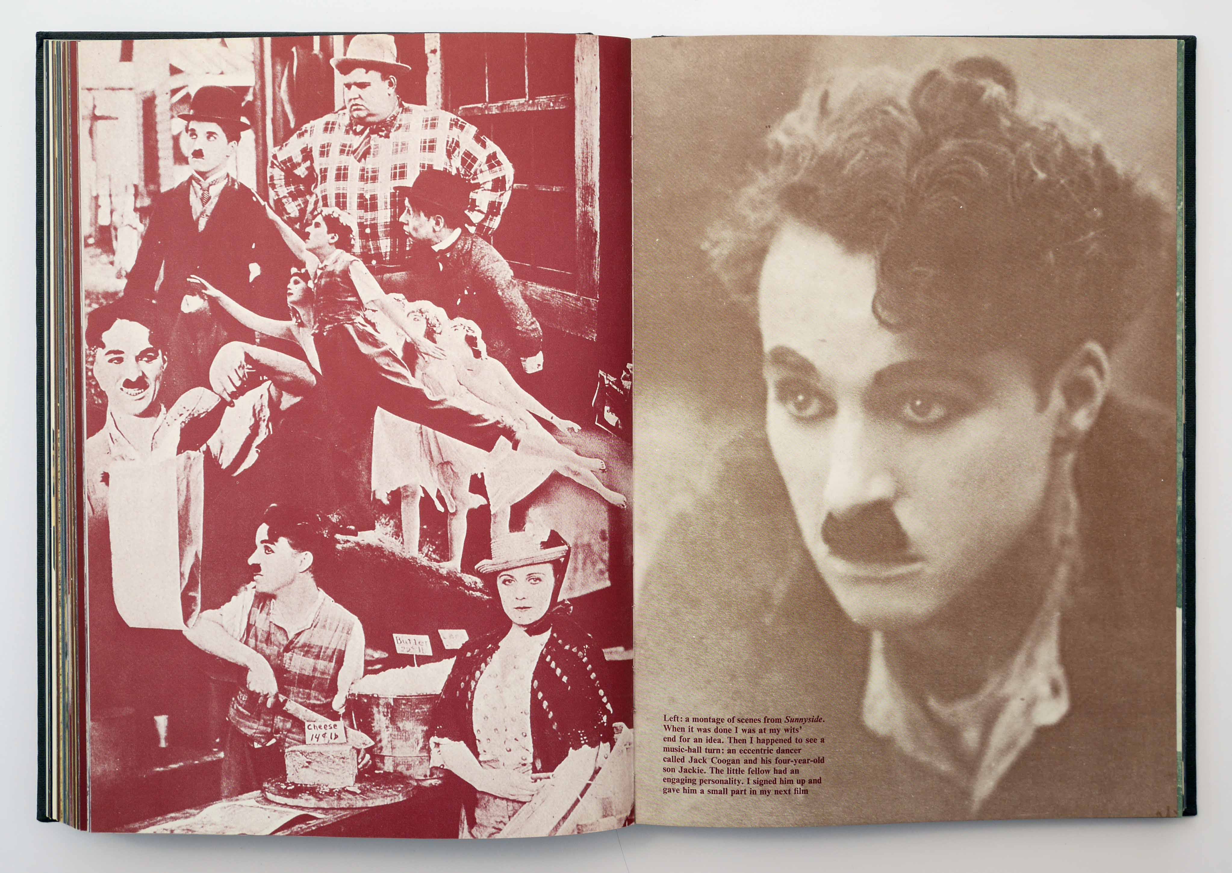
Wyndham’s introduction has a three-column grid with assertive rules, making the pages close in style to The Sunday Times Magazine. As with Trotsky, King loads the text spreads with photographs and other documentary material, sometimes placed at a jaunty angle, and all given a subdued yellow tint to impose visual unity. Elsewhere in the book, he leaves relatively few black and white photos unfiltered and, with the exception of the four-colour visual essay, colour images such as posters receive the same monochromatic treatment, presumably at least partially for reasons of cost. King appears to relish this constraint. He constantly shifts between a palette of yellow, maroon, magenta, brown and blue, achieving many bold contrasts. The book has barely any white space, the margins are small and many pictures are full-bleed. As the narrative unfolds, the sensation of being almost overwhelmed by the content has something in common with the colour-saturated collage layouts of the 1960s and early 1970s underground press.

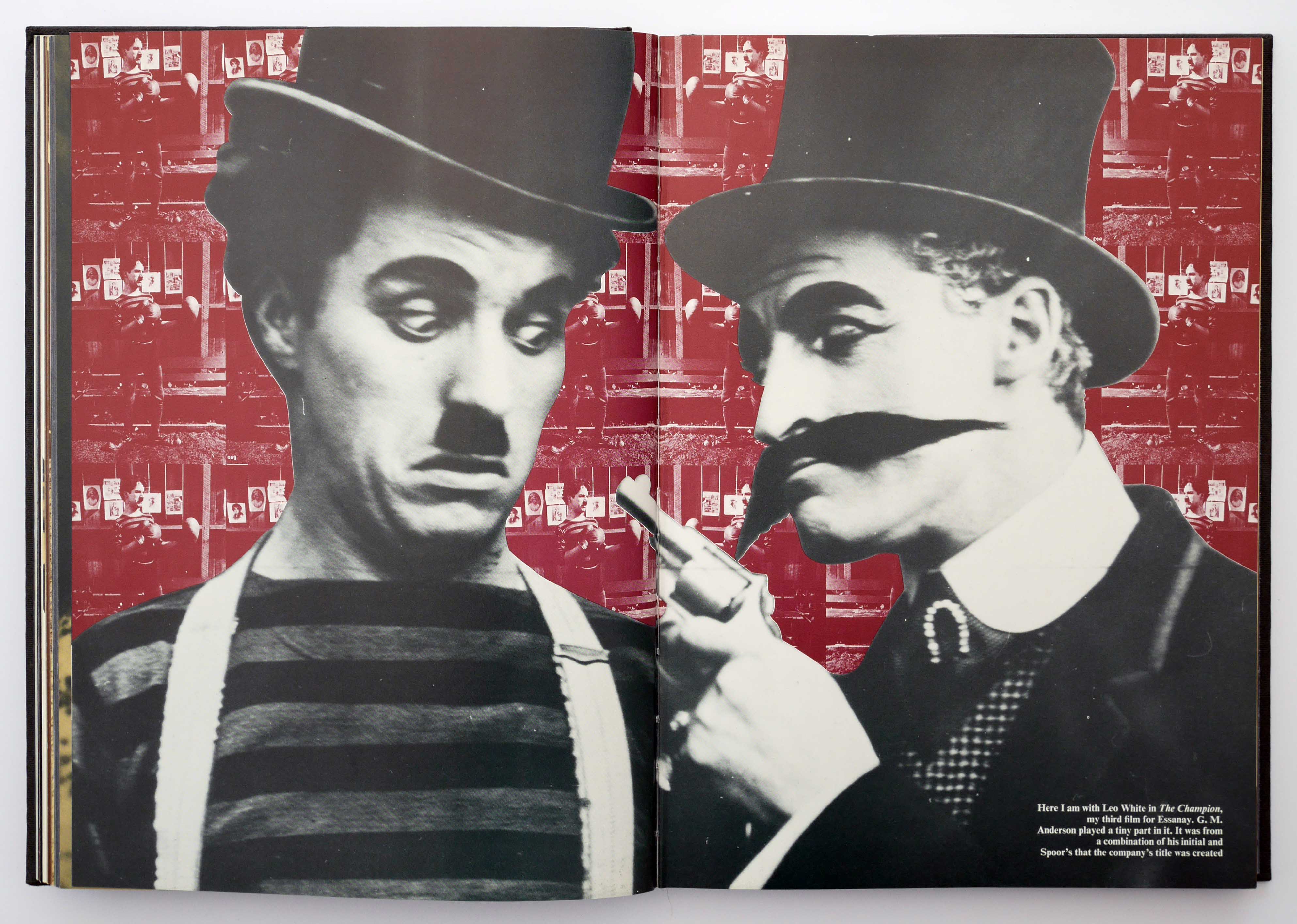

The reading experience, as with King’s later books about Russian history, is totally immersive, with never a lukewarm moment, undersold picture, or dip in momentum. Nine years of editing images week after week to tell visual stories in The Sunday Times Magazine had given King a highly trained eye for the telling picture and the best way to use it with other pictures to build an engrossing narrative. While the arresting juxtaposition of optimally scaled images is the book’s operational principle, he periodically takes this to a more refined level by employing photomontage or arranging photographs in sequences and grids to suggest the frames of a moving image. Careful not to overdo these intensifying effects, King achieves a judicious balance between modernist devices and the more conventional layouts a celebratory book would normally present.

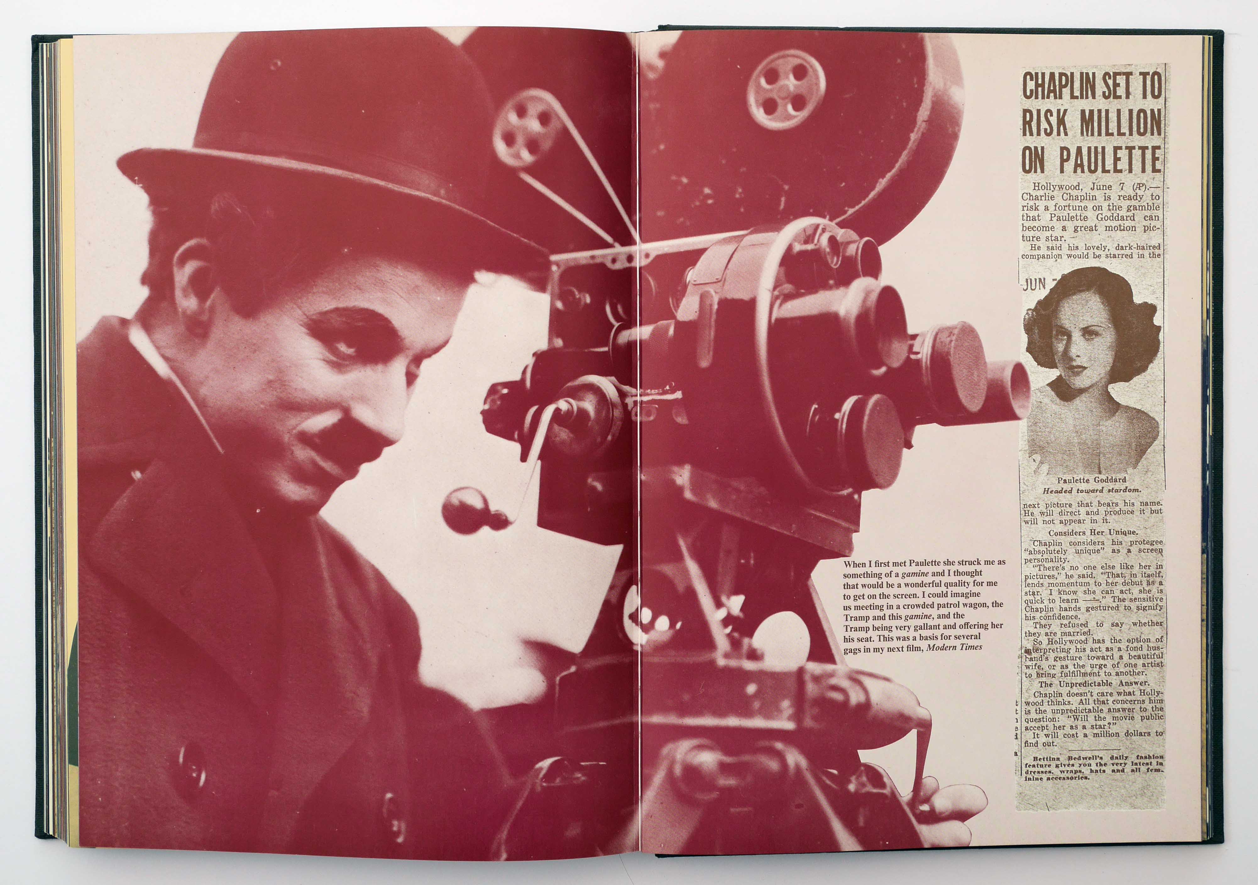

The Sunday Times Magazine reacted to the book’s appearance with considerable largesse. A few days before publication, the 20 October 1974 issue ran a 10-page exclusive cover story – shown in its entirety below – with the same images and title, “My Life in Pictures”, along with re-edited text from the book. To produce the cover picture, two portraits of Chaplin shown as a diptych in the book are superimposed to become one – perhaps to even greater effect.
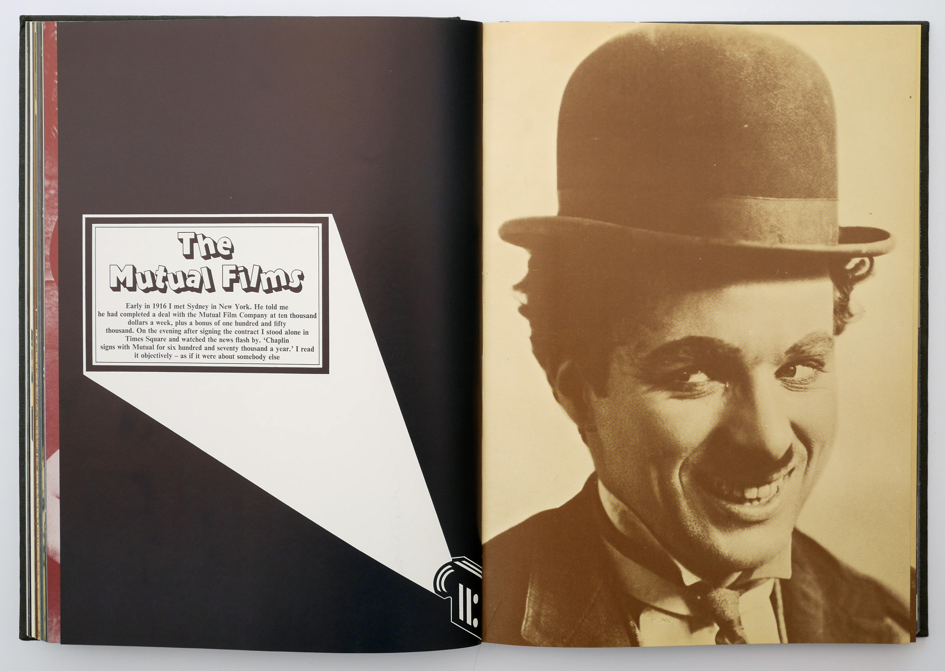
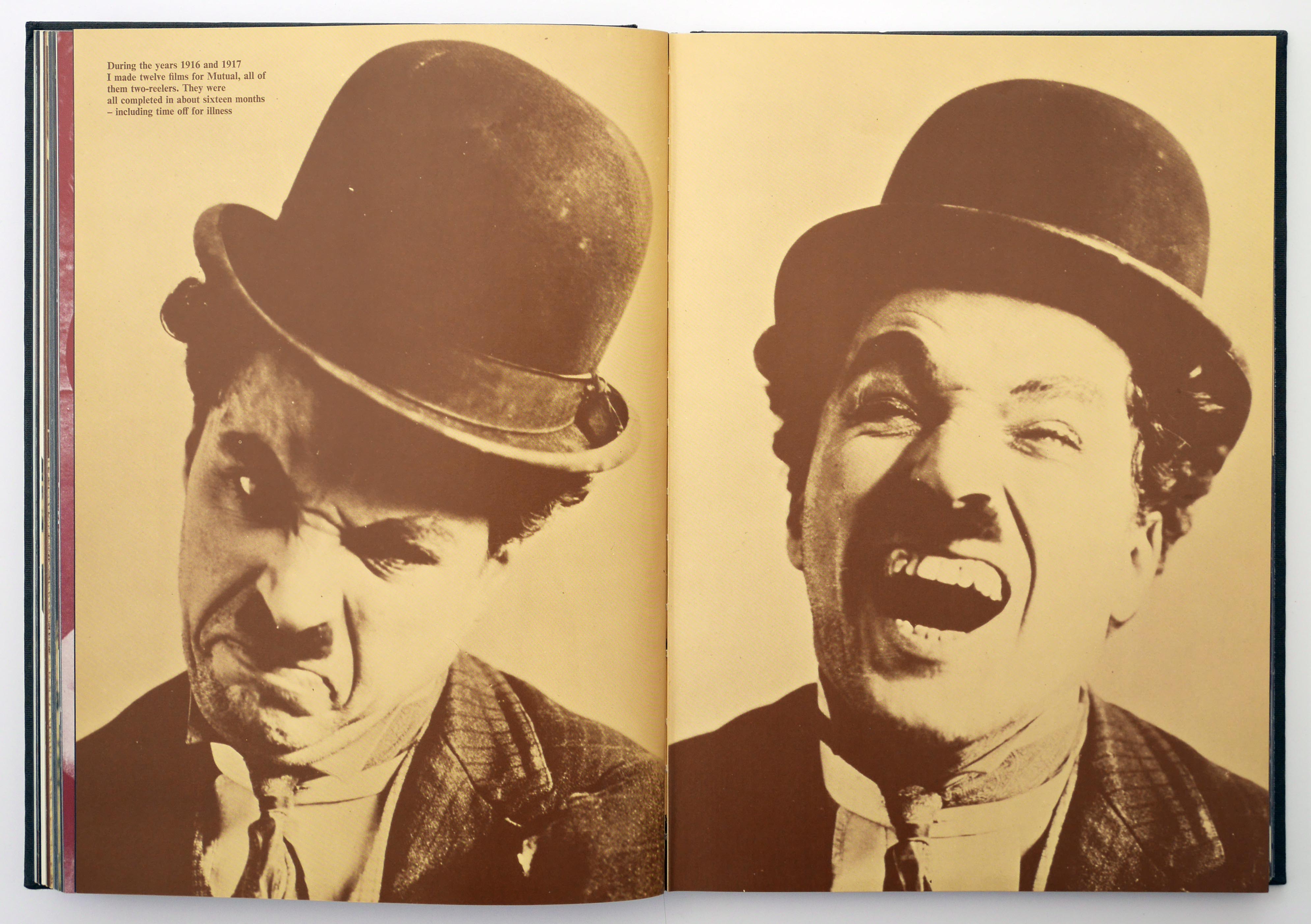
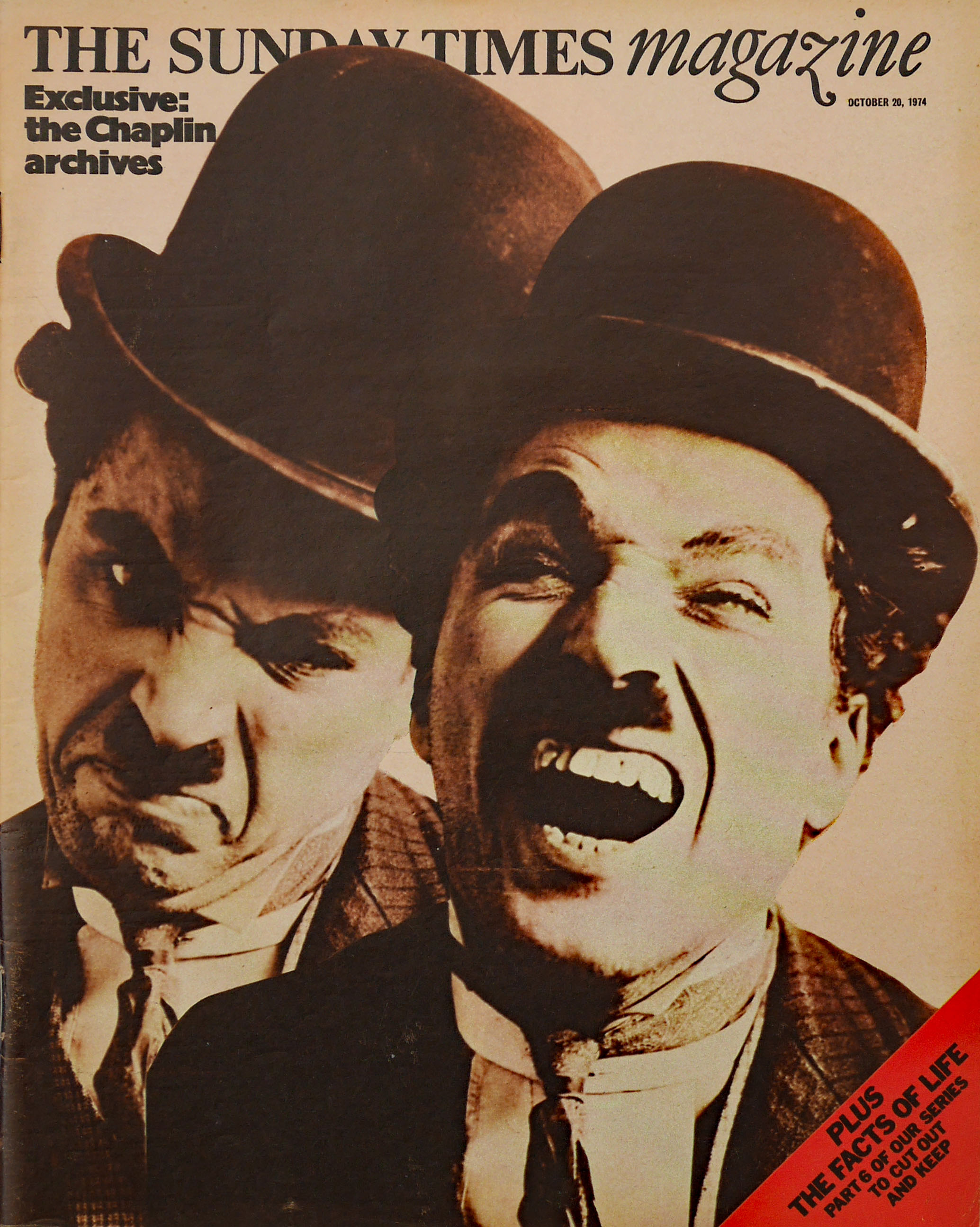
King was in the unusual (if not irregular) position of being able to design the pages of a high-profile weekly magazine promoting his own and Wyndham’s work – the opening spread does state that he was the book’s designer. As if this publicity bonanza wasn’t enough, the magazine was sufficiently confident of Chaplin’s enormous appeal to run two further eight-page features drawn from the book on 27 October and 3 November.
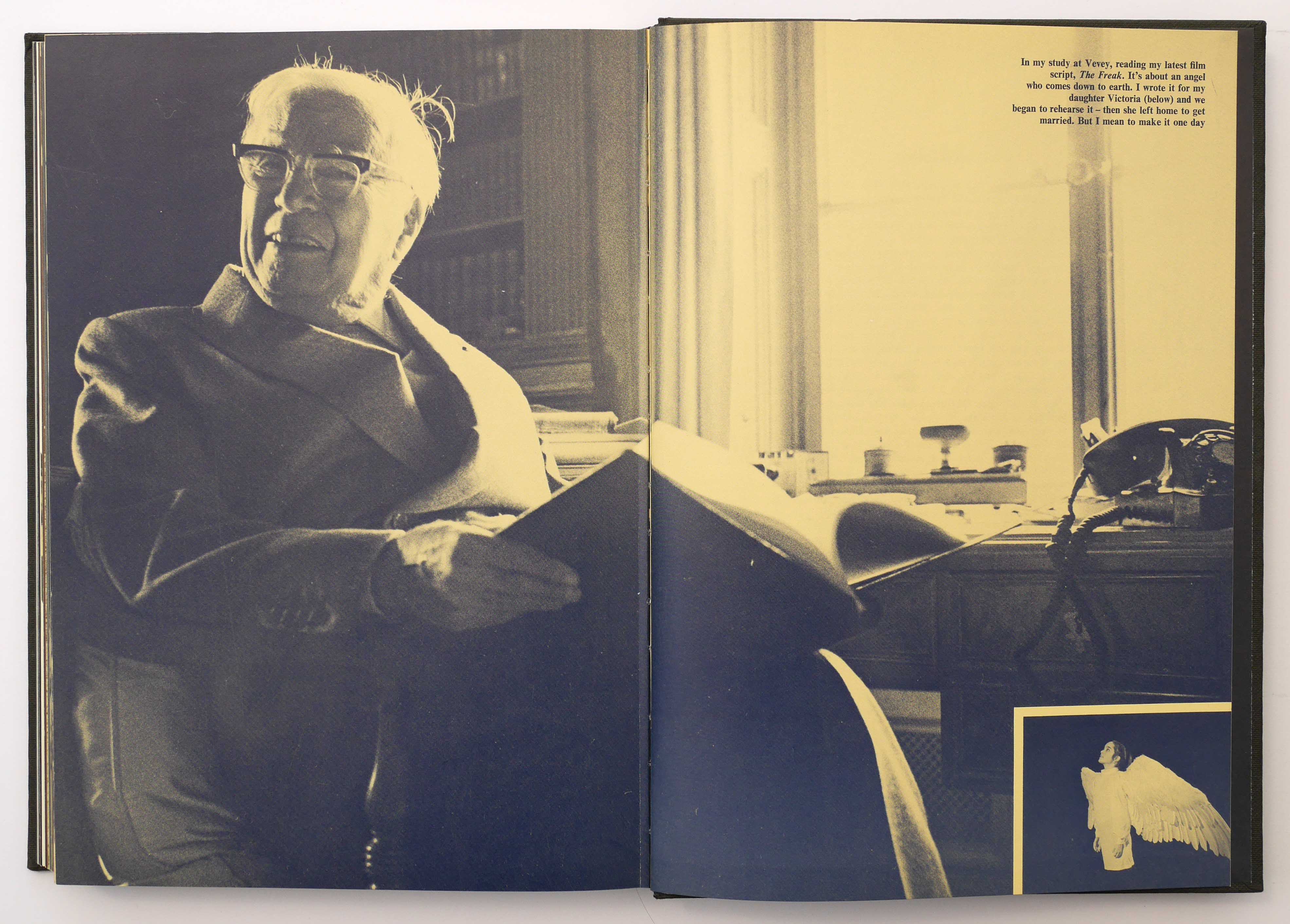

Wyndham and King’s Trotsky book ends with King’s photographs of the Marxist revolutionary’s house in Mexico and he does something similar in My Life in Pictures with a photograph of Chaplin he made at the actor’s home in Switzerland. The portrait is uncredited, but its “last word” position in the book is a subtle assertion – at least for himself – of King’s crucial role in its creation. He used a picture from the same photographic session for the opening spread in The Sunday Times Magazine and, here, the somewhat less successful portrait is credited. The 26 colour supplement pages are a complete remix of the original book layouts, presenting images in new combinations and, in the first instalment, without manipulating their colour – a much less mediated and more purely documentary visual style.
Seen side by side, the two publications demonstrate King’s exceptional range and fluency as a visual editor and constructor of arresting image sequences. On these foundations, he would build his career as a visual author.
Updated on 10 and 15 July 2022. Thanks to Ian Denning for additional information
