Perfect to the Letter (1985)
Profile by Jeremy Myerson
It must be more than mere coincidence that two of Britain’s most influential typographers in recent times have each had a go at designing City Limits. Neville Brody, the name behind The Face, is the architect of the London entertainment guide’s latest look. But although it is commercial and fashionable, many people still prefer David King’s more gutsy original design, especially his type-only covers which drew heavily on Soviet Constructivist typography in the 1920s.
Comparison between Brody and King is revealing. Brody is a self-conscious purveyor of style whereas King takes a totally different approach. “I’m not into cocktail bars, rock music and layout,” he says. “I’m less into form than content. I’ve never been interested in typography for its own sake since I see it simply as a vehicle for visual communication.”
Not surprisingly, King’s track record in publishing suggests that his most powerful work has been produced when he has felt emotionally committed to the subject matter of the books and magazines he has been designing. In particular he has become known as the designer of the house style of the broad left.
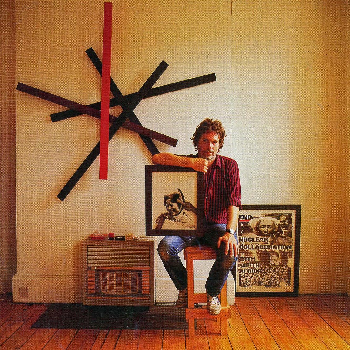
The thick black rules, the duotones, montages and capitals-only chunky typography that characterised posters for the Anti-Apartheid Movement, Rock Against Racism, Anti-Nazi League and National Union of Journalists in the late 1970s are all part of a deliberately limited visual vocabulary that King uses repeatedly and to good effect in his work. “I never got paid for most of that stuff,” says King, 42. “It was a political act.”

David King trained in typographic design at the London College of Printing in the early 1960s before going to work with Tom Wolsey, one of the most celebrated designers of that period. In 1965, Michael Rand offered King the job of art editor of The Sunday Times Magazine and he was able to steer the supplement through its heyday.
He art directed memorable features on Cambodia, Vietnam, Cuba and Biafra, many of them photographed by the legendary Donald McCullin. “It was a fantastic period,” recalls King. “I did a lot of travelling, originating features and taking photographs. We would be given nine or 10 consecutive spreads on a singled subject – a famine, for instance – to develop the story. You don’t see that nowadays.”
In 1970, King organised a feature on Lenin and travelled to the USSR to do picture research. This sparked his interest in the history of the Soviet Union – a passion that has dominated his career in recent years.
In 1975, King quit his job in exasperation at “the consumer journalist idiots who were coming in to replace photo-reportage with advertising features.” He went freelance and turned his attention to improving the design standards of political brochures and posters of the left and to building up a huge photographic and poster collection of the revolutionary period of the Soviet Union.
Today King has a unique archive – one of the most comprehensive visual histories of the USSR available as a photo library – and he has also produced a series of books for Penguin, Jonathan Cape and most recently, Basil Blackwell on Soviet subjects. “I design the books myself and just present the publishers with finished art work,” says King. “Ironically, I have tracked down most of the material in the West.”
King explains that his distinctive style was born of necessity. Working with political groups or impoverished publishers like the City Limits collective, he was forced by lack of money to use cheap materials and inexpensive, inexperienced printers.
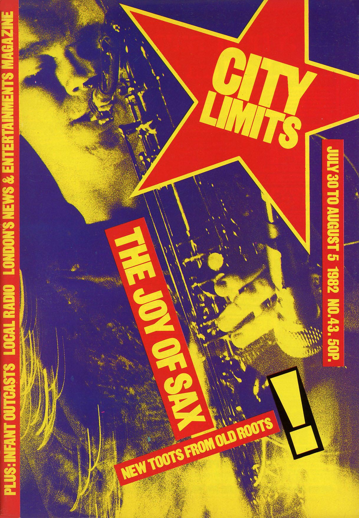
“I had similar problems to the designers of the revolutionary Soviet posters,” he says. “To make sure I got the message across, I went for blackness with a second printing, thick slab rules, unfussy typefaces – strong basic design elements you can use in conjunction with photography.”
King favours faces like Franklin Gothic Heavy and Grot 9 Black. But he also hunts down old wood blocks from printers and uses PMTs to create unusual lettering. The resulting typography usually has an elegant, imposing toughness, but King is unconcerned that his typographic style tends to dominate the subject whereas conventional wisdom among designers is that the subject should determine the way type is used.
One of King’s current projects has raised eyebrows in publishing circles. He has recently been appointed art editor of Crafts magazine by the Crafts Council, and the glossy magazine’s neat, classic design (by Bruce Brown) has been transformed in a matter of months into a typically robust piece of King work.
Crafts editor Martina Margetts says she employed King because of his “enormous visual strength – I wanted the magazine to have a wider impact beyond the crafts ghetto.” But has King managed to display his characteristic commitment towards ceramics and weavers?
“He hates things like paper jewellery,” says Margetts. “But he likes the integrity of certain crafts. He loves a good teapot and well-designed furniture.”
Originally published in Creative Review, vol. 5 no. 9, September 1985, pp. 14–15. The images above were among those shown. The article is republished here with the permission of Jeremy Myerson